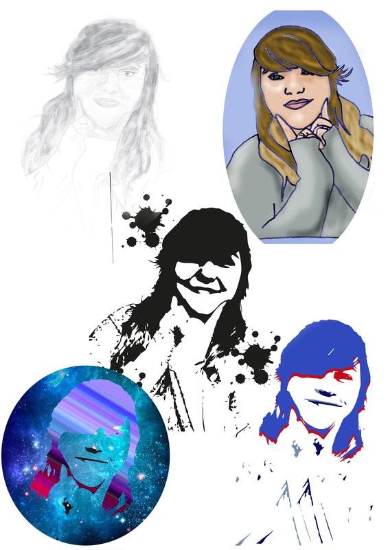
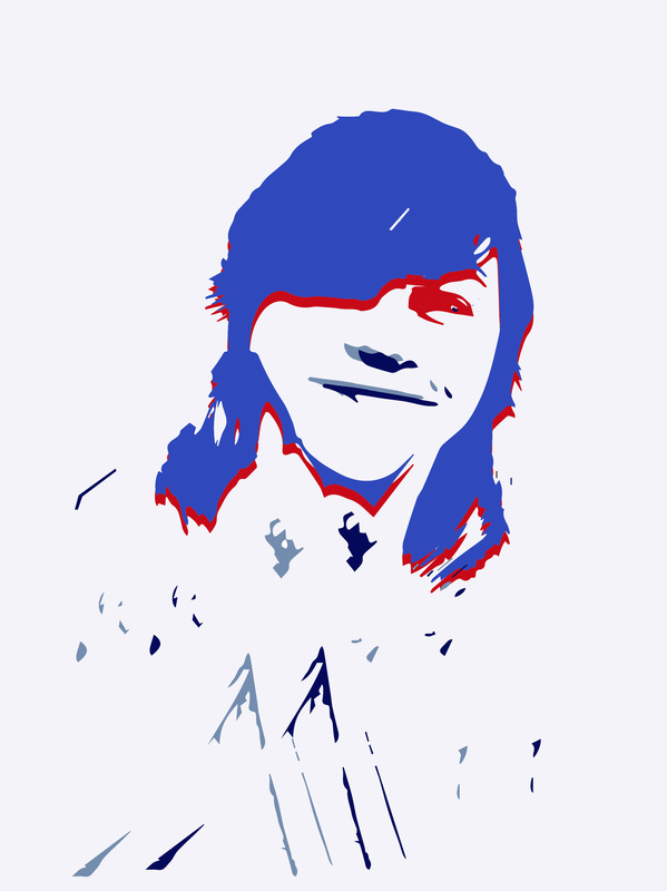
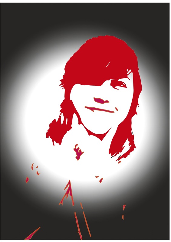
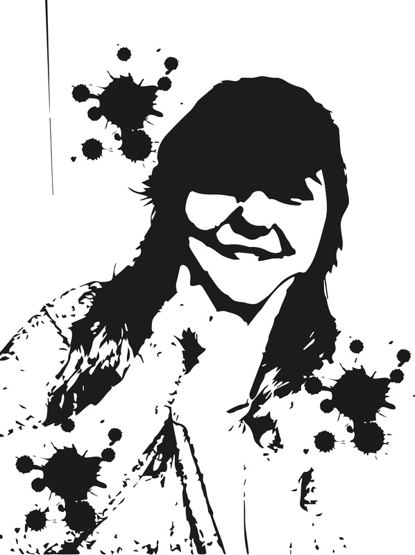
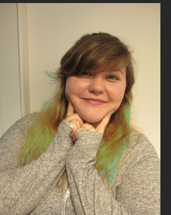
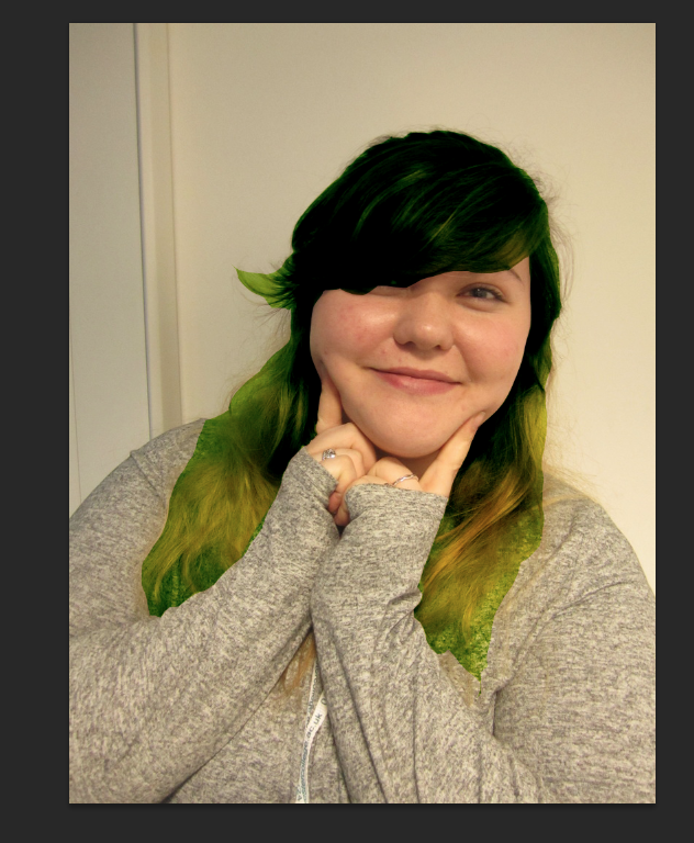
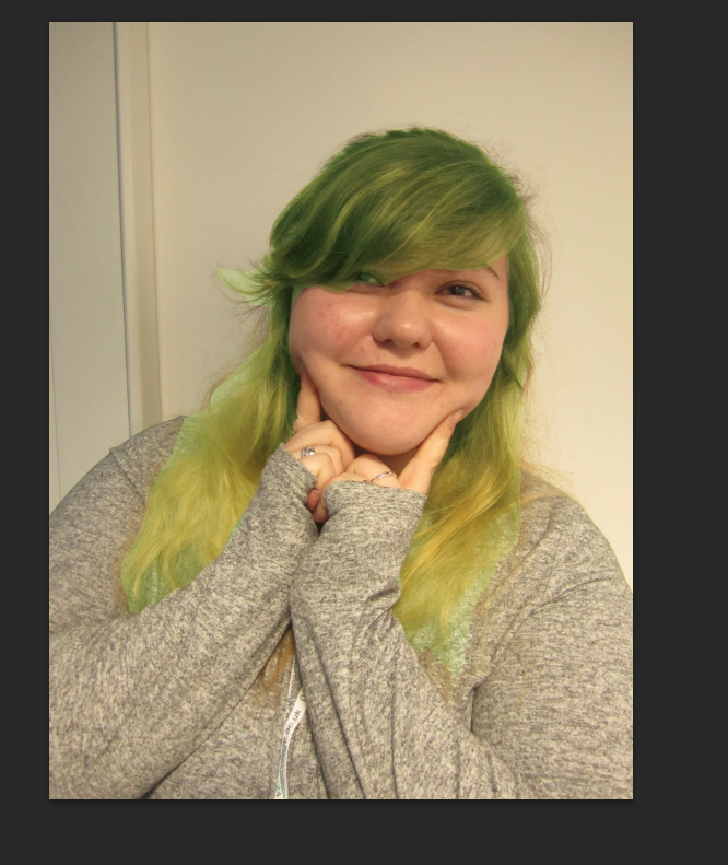
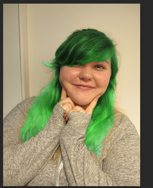
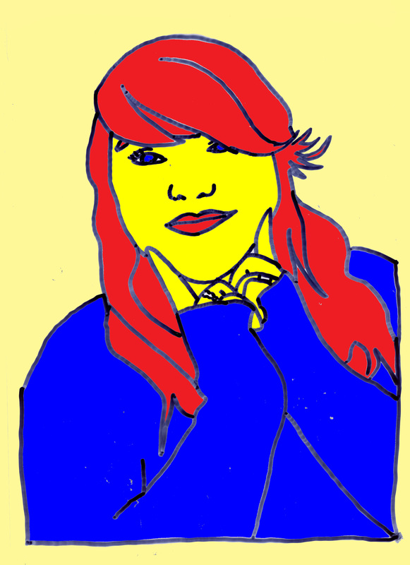
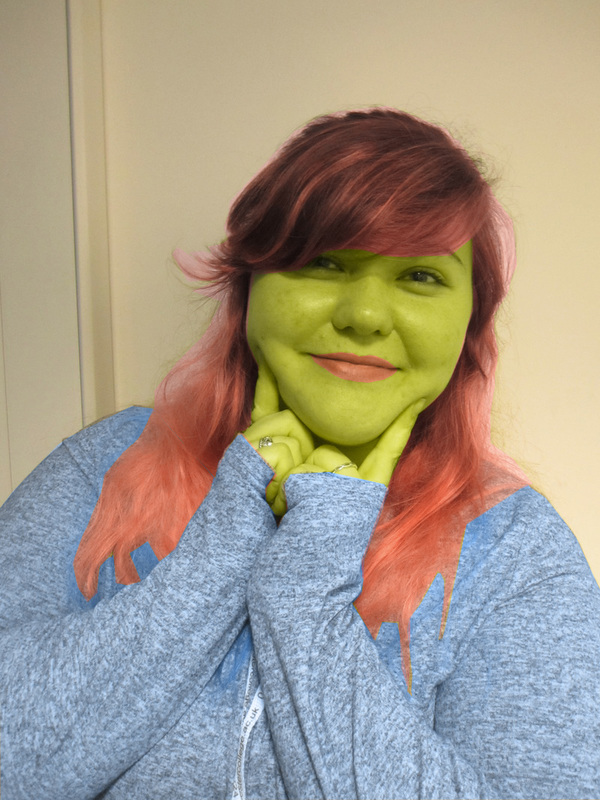
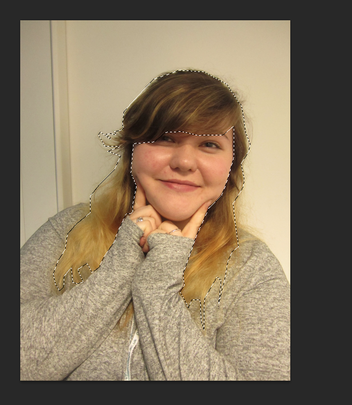
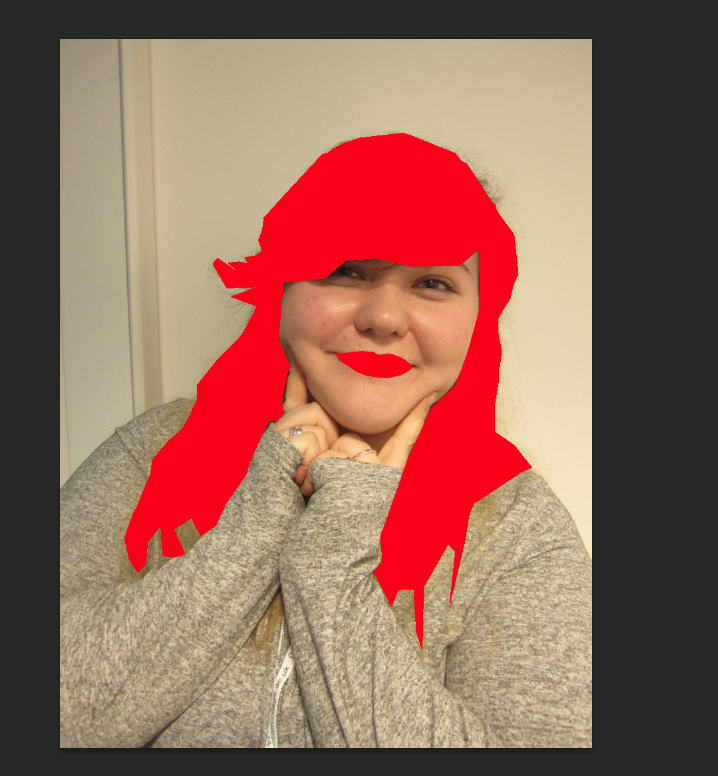
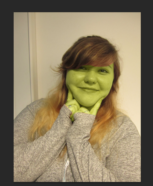
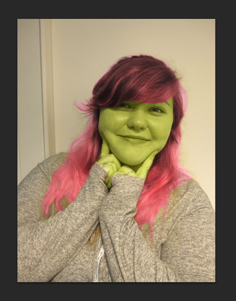
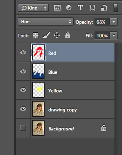
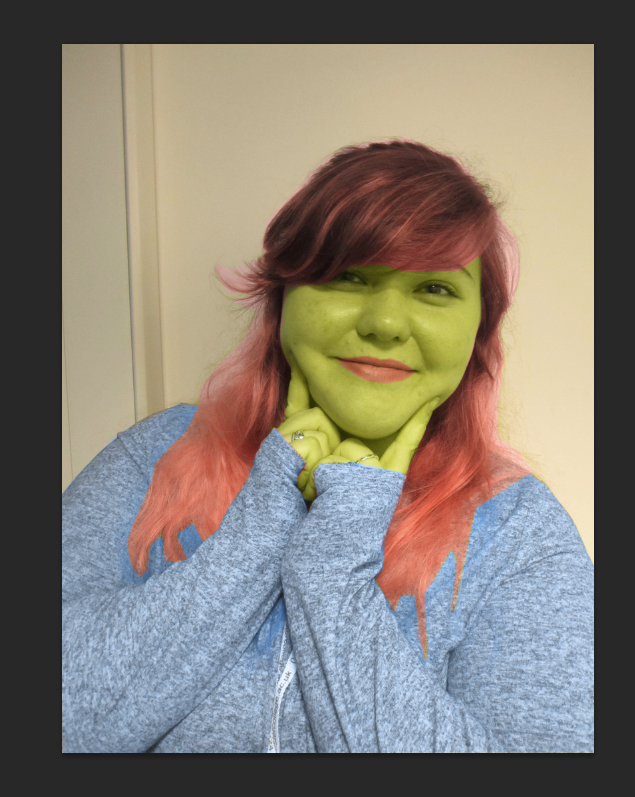
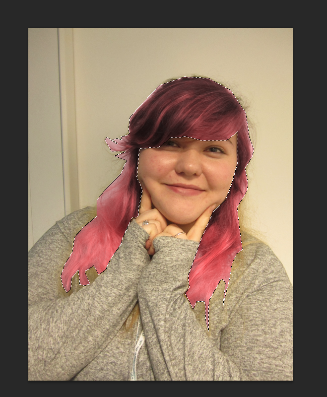
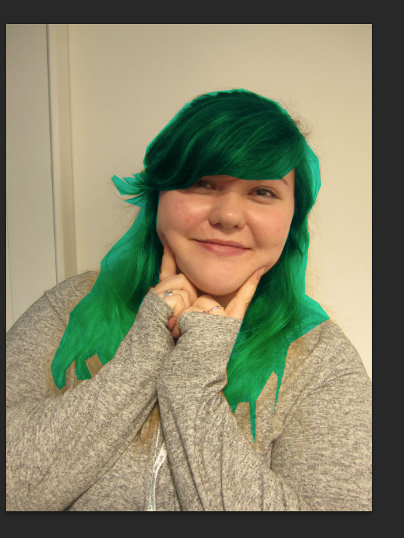
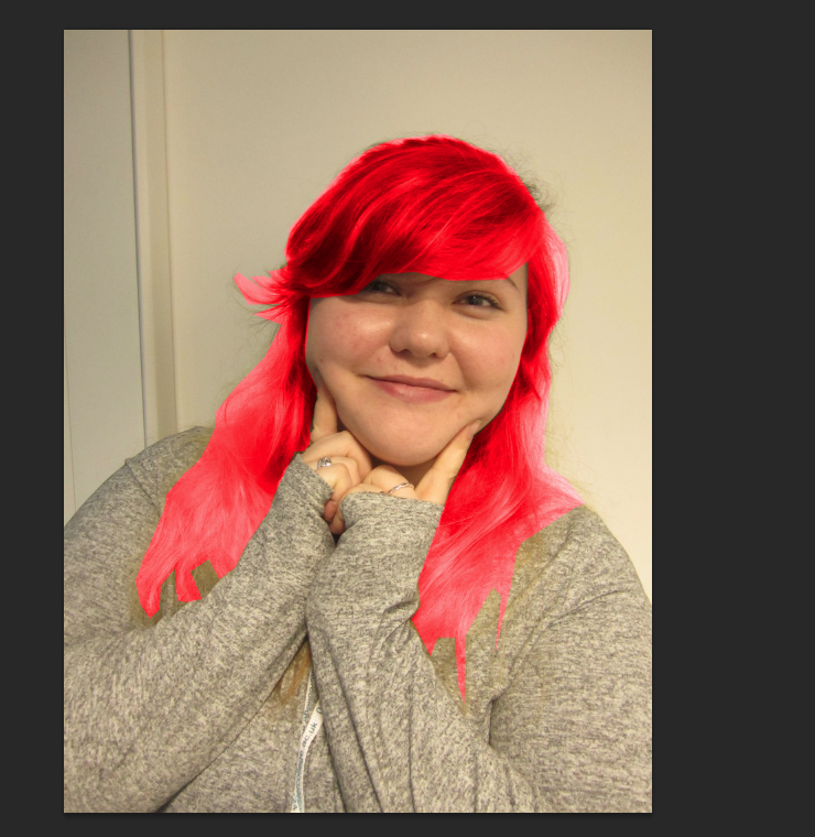
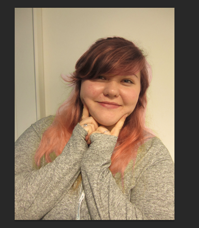
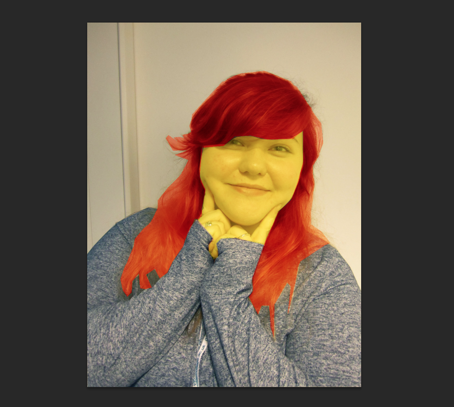
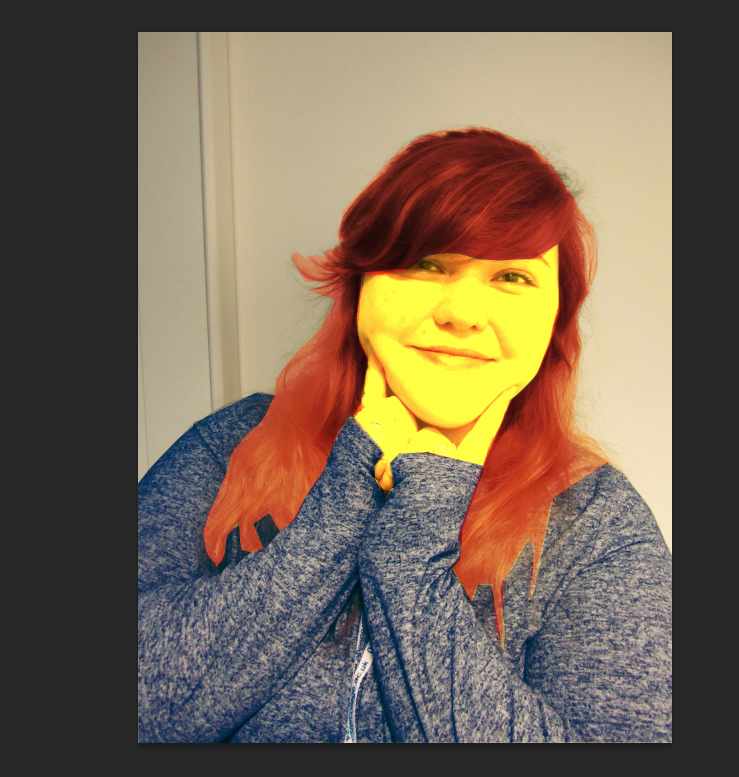
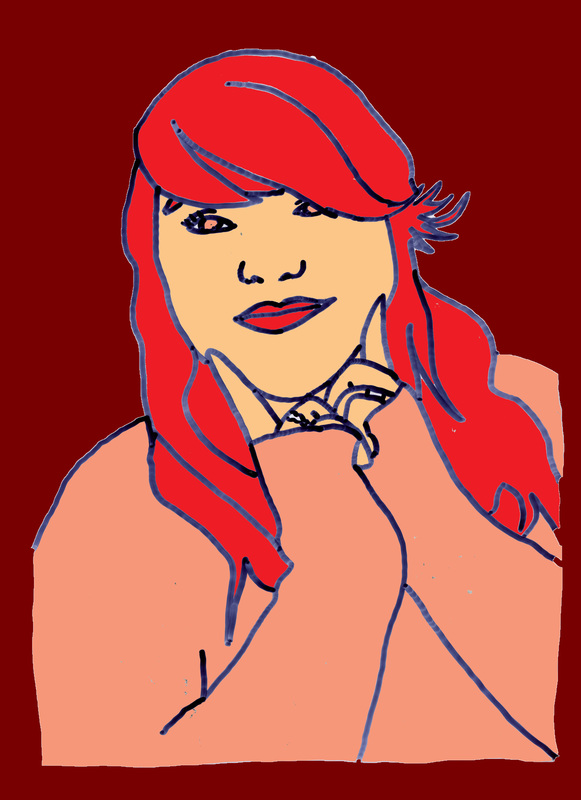
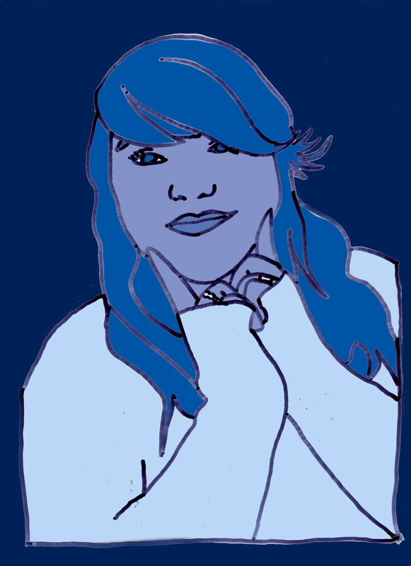
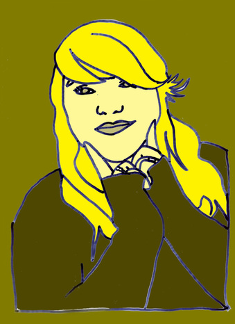
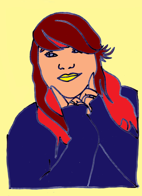
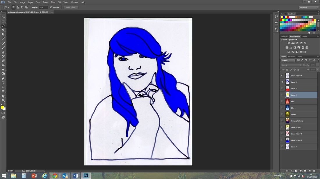
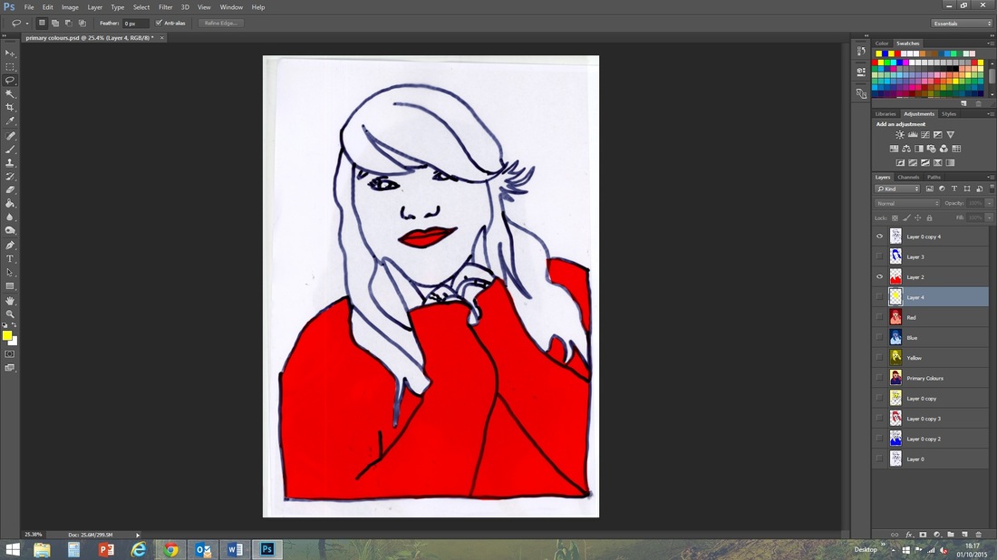
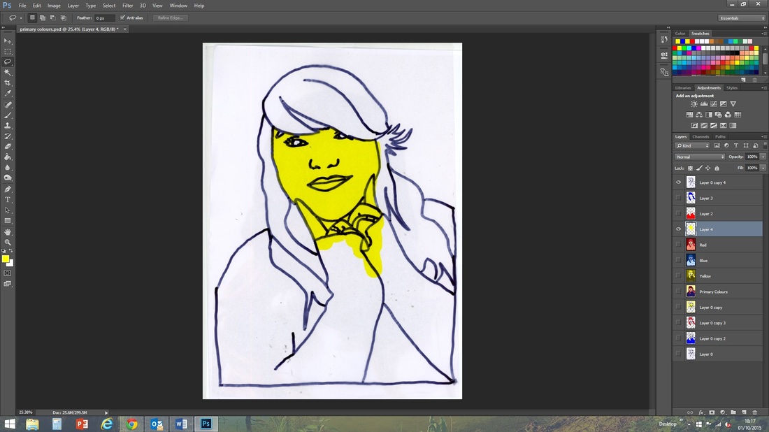
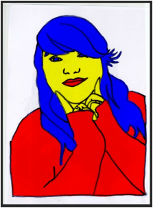
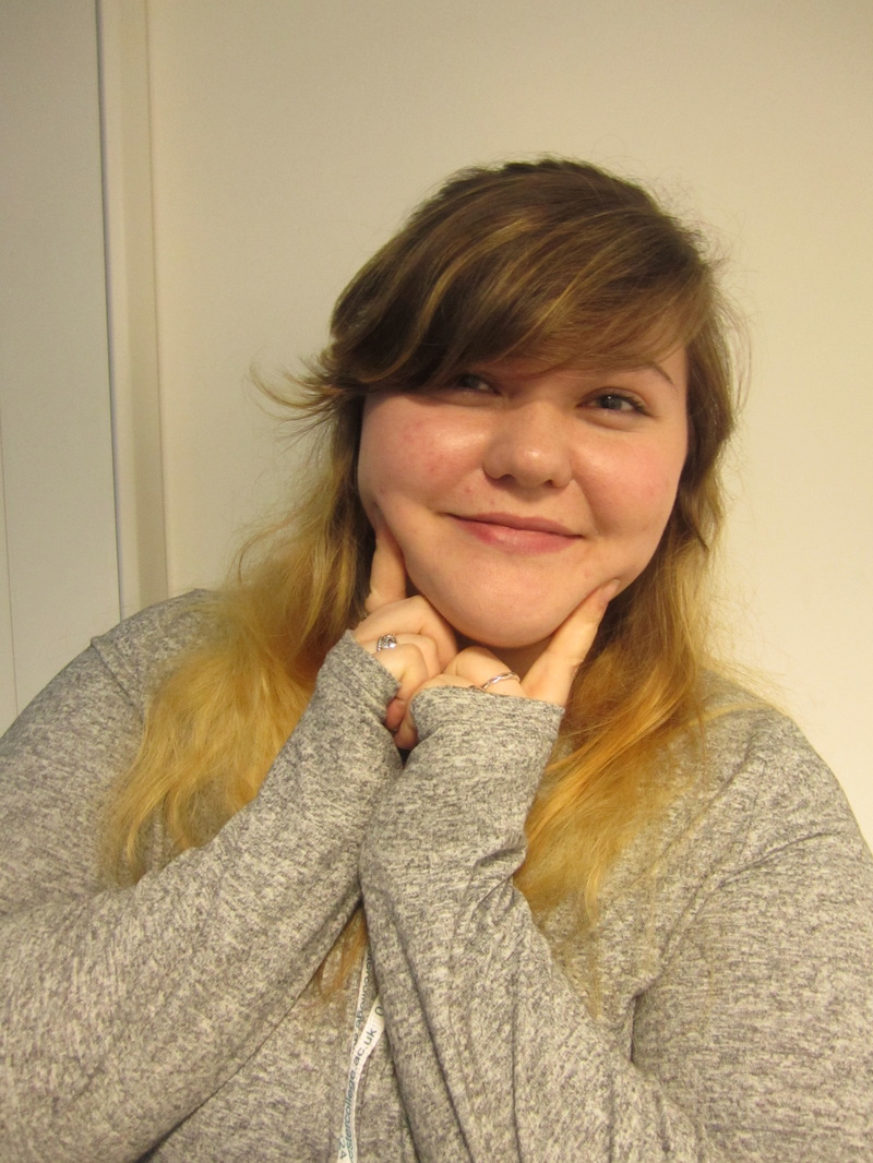
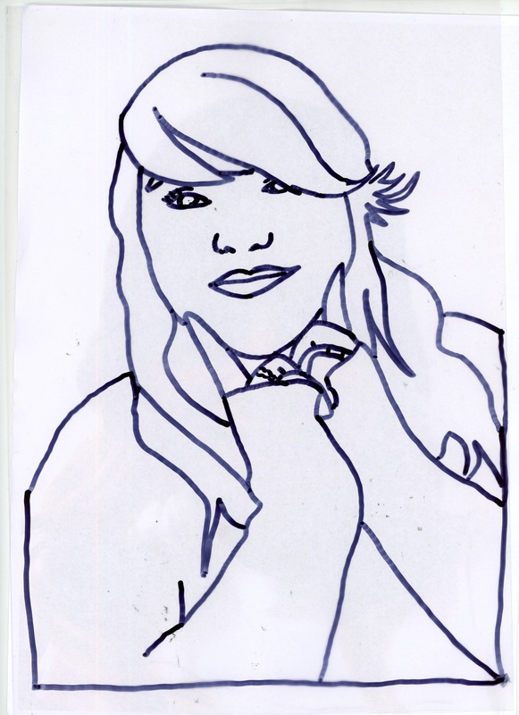
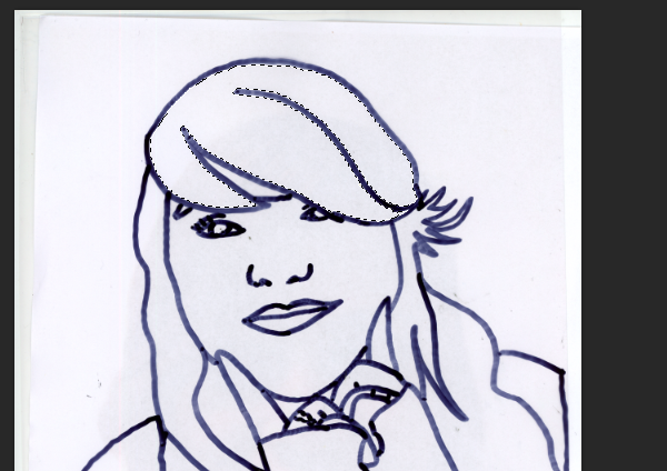
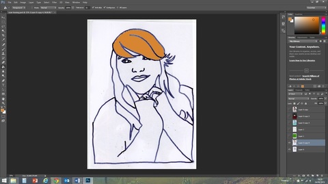
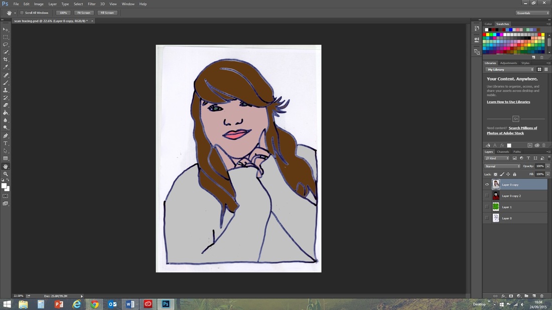
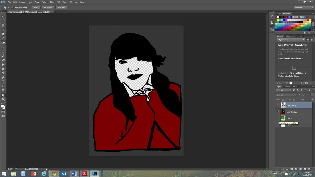
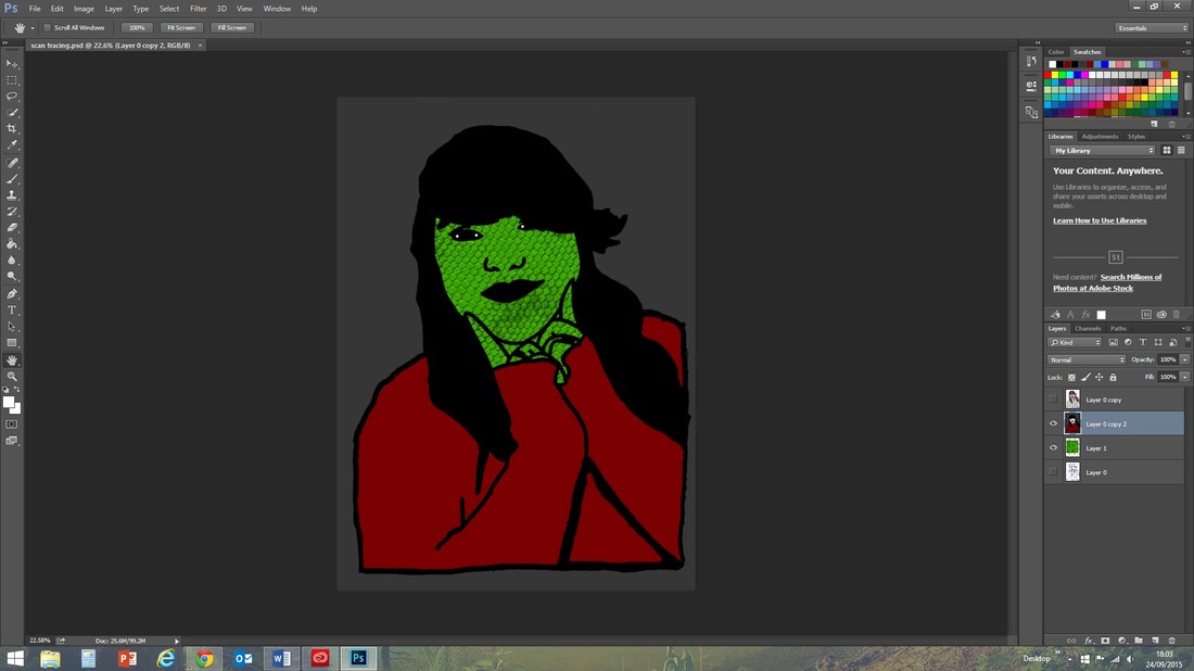
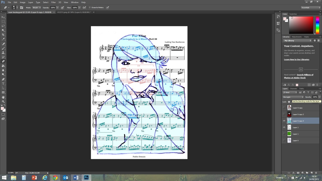
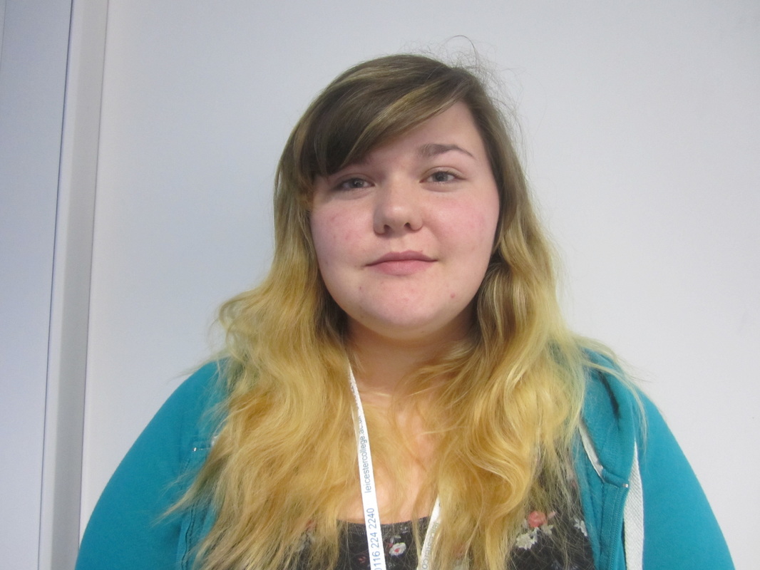
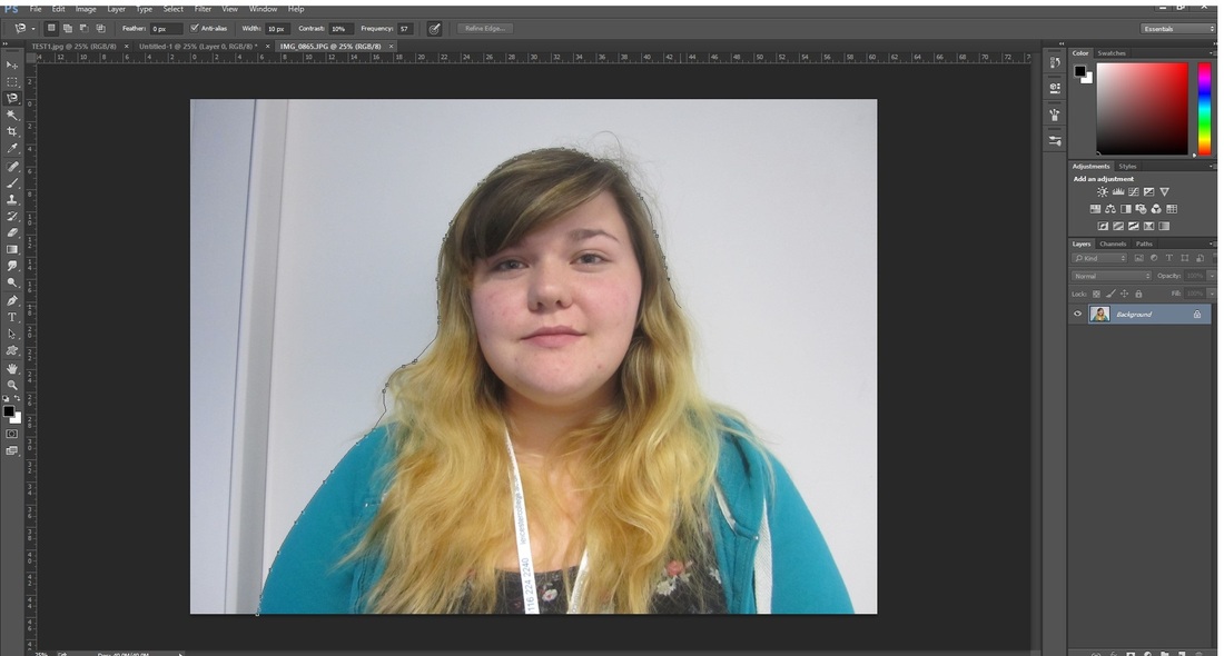
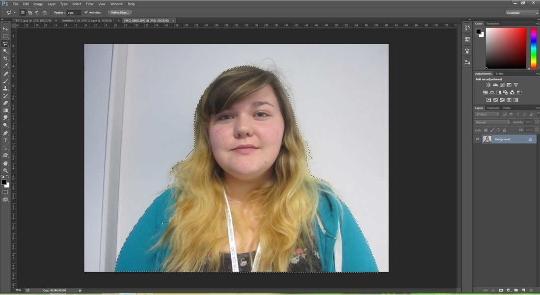
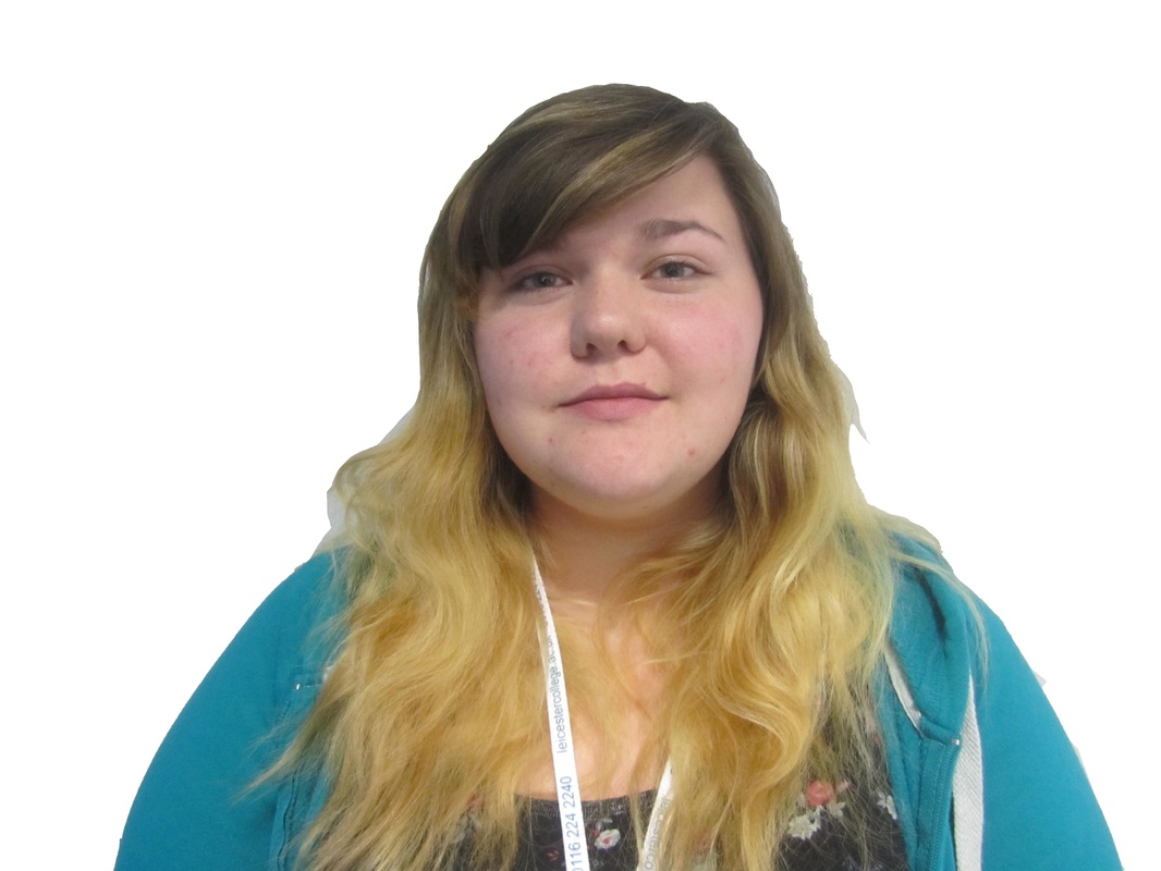
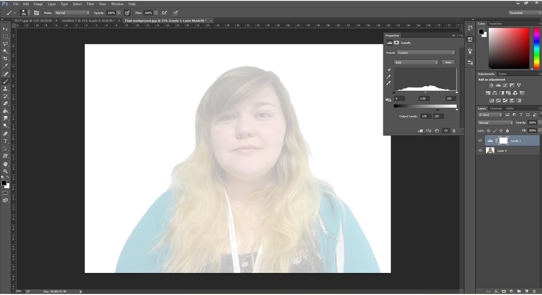
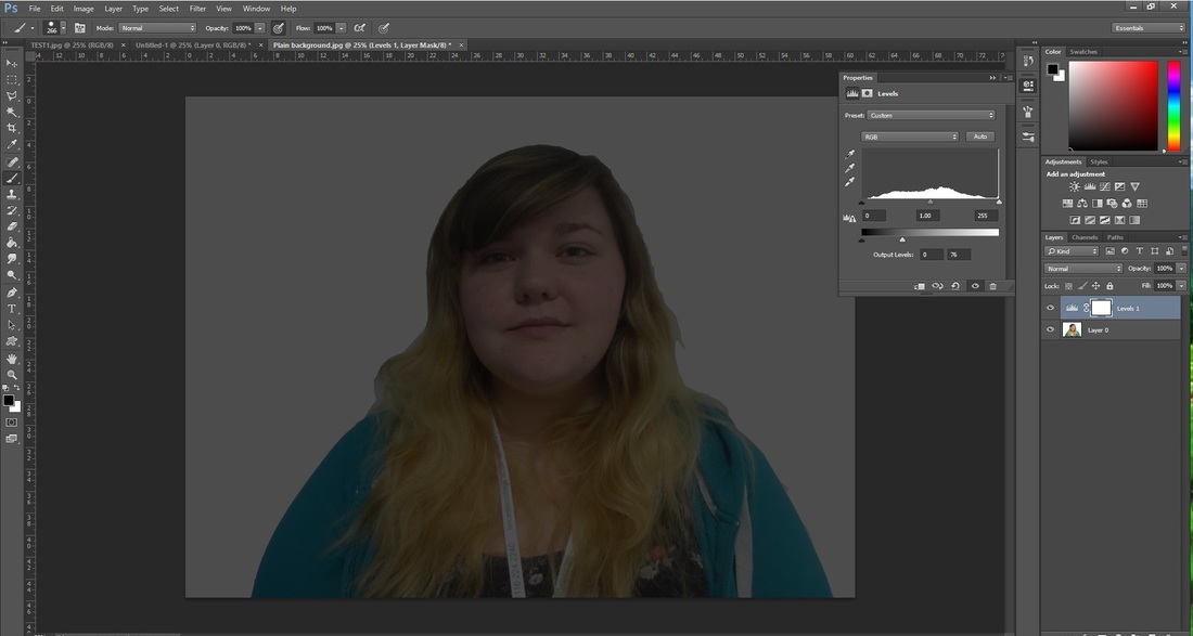
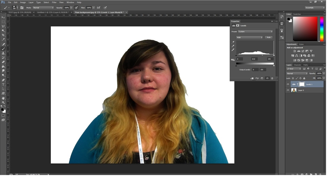
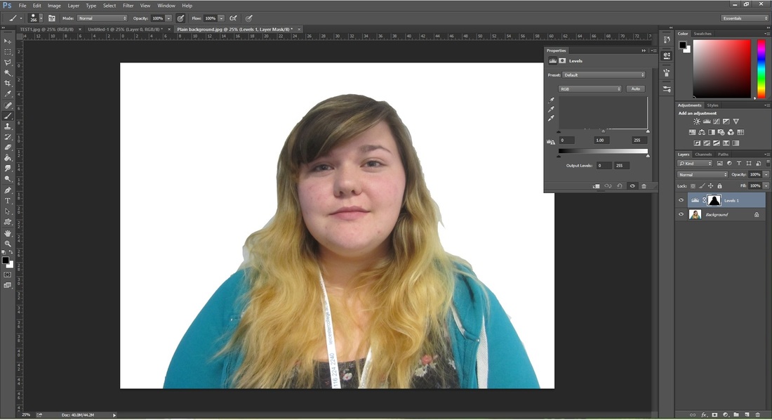
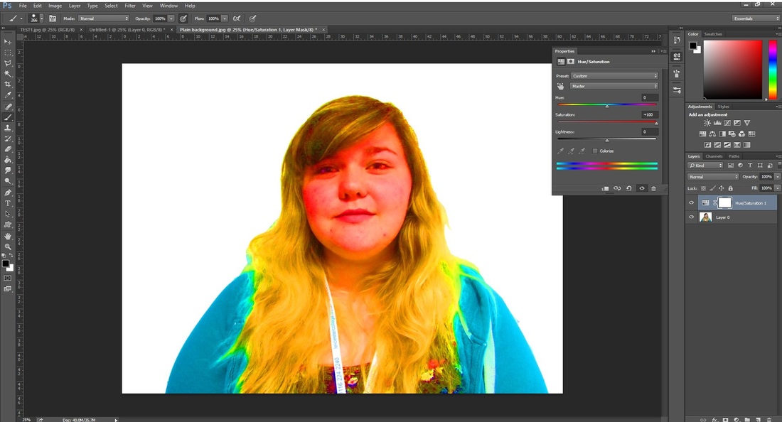
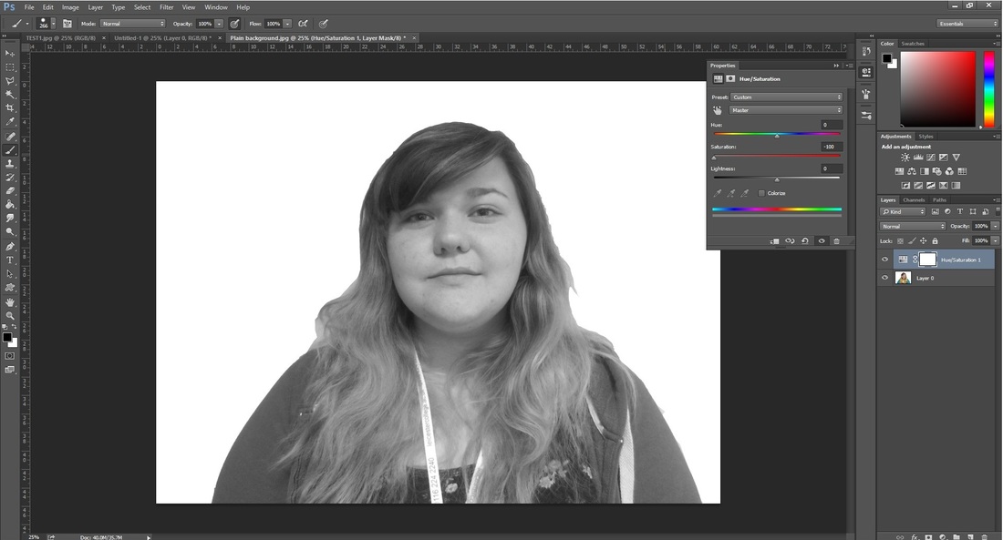
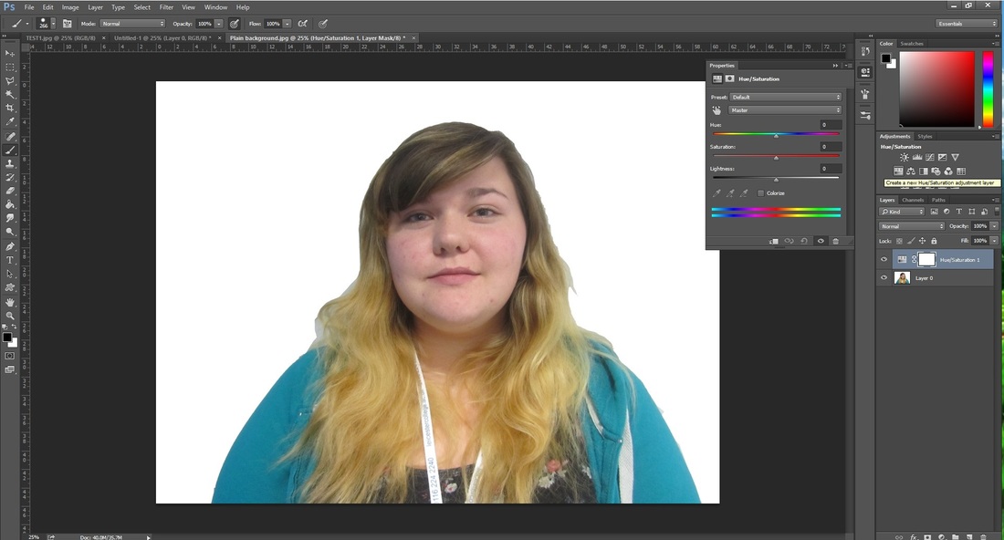
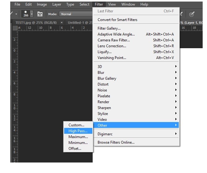
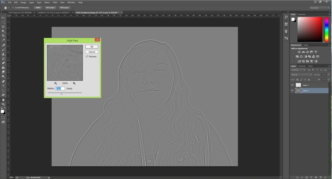
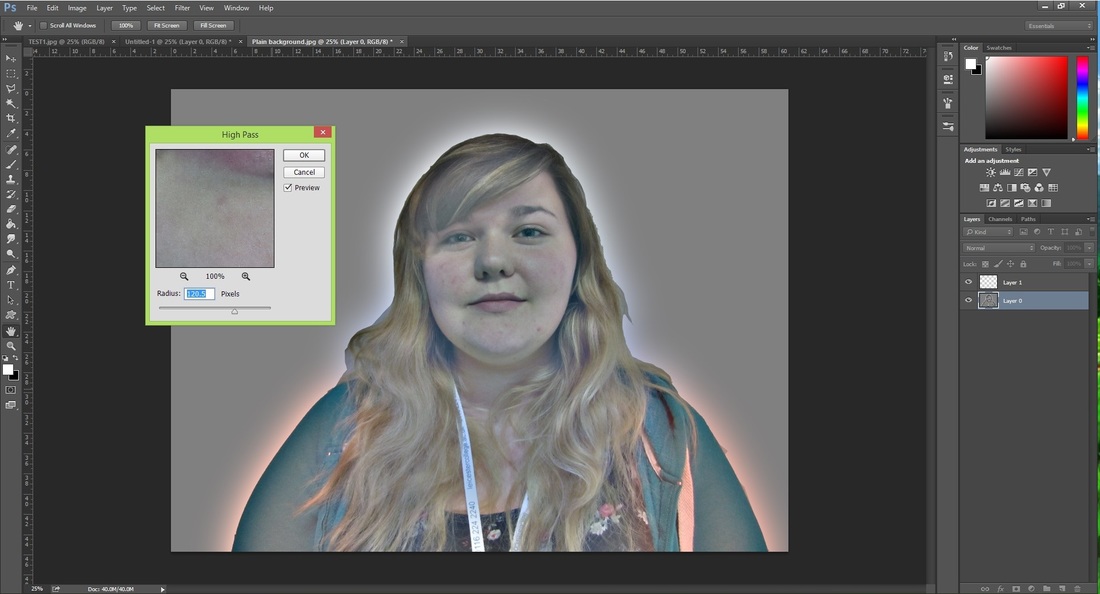
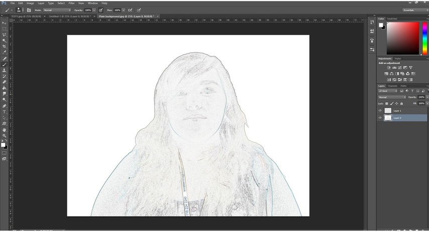
Here is my final piece combining all the methods I have explored in this unit from free hand digital drawing to selection and fill tool work. I have selected the pieces I believe are the best quality produced and show an array of techniques applied throughout this unit.
In this unit I have experimented with two programs, Photoshop and Illustrator. Both are programs designed to create and edit images digitally. With a digital camera I took a photo of myself and uploaded it onto the computer. This photo could then be edited in Photoshop and Illustrator in multiple ways. Using Photoshop's magic wand and polygonal selection tools and fill tools I could recolour the image as well as edit the filters and apply different effects to the image. In Illustrator I explored the image trace feature and how certain graphic effects can be applied to the piece. Out of the two I found Photoshop to be the easier program to use, most likely due to myself using the program more. However, the image trace feature found in Illustrator was a very handy tool when creating my pieces. I found selecting and filling areas easier when using a pre traced image and the quality of the image dramatically increased with the aid of Illustrator. The left image was created using solely Photoshop and the right combined Illustrator and Photoshop. As you can see the whole image is improved by the inclusion of Illustrator in the design process. With Photoshop alone I found it difficult to the achieve well defined curved edges and instead had to make do with a more jagged look. The image trace in illustrator allowed me to fill the areas effectively as well as to duplicate and manipulate them before moving the image into Photoshop. Overall I feel these two techniques and programs work well together and I hope to in the future be able to enhance my skills to be able to use Illustrator effectively as a program on its own.
Another program I am able to use and develop work with in CAD is Illustrator. This program is designed specifically for creating graphics. The program has an element called Image trace which effectively takes out all colour and turns the image solidly black and white. With this image trace applied the threshold can be manipulated to increase or decrease the areas covered by black or white picking up more shadow or light. These two images (above higher threshold and below lower threshold) demonstrate the image trace feature on my photograph. With these image traces I could then manipulate and enhance the image in Illustrator or Photoshop. illustrator is a program specifically developed for graphic design and incorporates more features than Photoshop to create graphics. Patterns and manipulation of images are available as well as effective distortion applied to create strong imagery. There are certain brushes and tools available such as ink blot that I used on my image trace. Other elements such as adding frames to an image are already set up in illustrator and filling areas with patterns designed by yourself are much easier. Using Image trace in Illustrator, the image created can also be edited in Photoshop. This is the method I used to create several images filling the traced areas with colours and other photographs as textures. I found this method of using image trace and then editing the traced image in Photoshop to be the easiest method in creating pieces of work. Although specifically designed for this work I was not as skilled in illustrator techniques and found it much easier to bring the image back into the program I already knew.
Having completed my two portraits, I can now compare and contrast the methods, tools and techniques I used to create each one. For my first portrait I used a scanned image of my photograph traced onto acetate. Opening this image in Photoshop, I then edited and added colour to the piece using the Magic wand and Paint Bucket tools. This process although quicker to achieve, did have its downsides. I found that I needed to go over the outline of the acetate tracing and certain marks from the scanner meant that I had to do some retouch work. For the second portrait, I directly worked on the image. Using the Polygonal selection tool, and the paint bucket tool again to fill areas with colour. I then changed the blend mode for the layers to create a translucent effect and a colour wash over the image.
Overall as a beginner to PhotoShop I feel that working with the acetate tracing was the easiest piece to create quickly. However, without further knowledge the piece becomes flat with large areas filled with colour. Working over a pre-existing image was more challenging but I feel that it is the most visually rewarding and with further application in both I can continue to create more effective pieces. To further improve both the acetate portrait and the overlaying portrait, I could incorporate other aspects in the piece as finer selection of pieces and using multiple shades in the piece as well as using tools such as the Dodge and Burn as well as incorporating filters in my work to add depth.
For task 2, I created a colour portrait in Photoshop (again using primary colours only), but this time I edited by directly using the photo taken by the digital camera not the traced image from the past task. The key to this task is the use of multiple layers, the Polygonal selection tool and changing the blending mode of the layers. To begin this task I opened up the file on Photoshop and duplicated the background layer. Then I created three separate blank layers and titled them according to the colour I would place on each. At this point, whilst selected on the drawing copy layer, I began to use the Polygonal Tool to select areas of the photo for editing. I began by selecting my hair and lips which I had decided would be red. After selecting all of my hair I then clicked onto my layer titled Red and used the Paint Bucket Tool to fill the selected area. For this image I decided that Hue was the best blending mode as it gave a more subtle effect to the colour with the addition of editing the Opacity and Fill of the Layer. Moving on to the next primary colour, yellow, I went back to my layer titled Drawing Copy and then selected with the Polygonal Tool all the areas of my skin. Once this was selected, I moved to the yellow layer and filled the selected area with the Paint Bucket Tool and changed the blend mode to Hue. Then viewing the the three layers altogether (Drawing Copy, Red and Yellow) I could see how effective the result was. All I had left to do now was edit the last layer (Blue). Again I made my Polygonal selection on the Drawing Copy layer and then moved to my desired layer to fill and edit the blend mode to hue. At the end I was left with several layers each filled with one particular colour and a nicely coloured image.
In this week's session the focus was on the use of primary colours top create a digital portrait. I also got the chance to use a graphics tablet in my work this week. The Primary Colours are of course: Blue Red Yellow Again I created my image using the acetate tracing as the week previous and the magic wand and paint bucket tool to fill the sections. I created several images using primary colours in many tones and one portrait using several layers to create one image. My first set of images consisted on sticking to different shades of one colour pallet for each portrait. And then I created one layer with all three colours. After creating a series of primary colour portraits in one layer, I progressed to make a portrait through the use of three; one for each of the primary colours. I felt that adding colour all into one layer reduced the quality of the image, small gaps from the scanning process showed through and by placing the colours onto different levels, I could neaten up the colouring process. For this, I edited my original acetate tracing layer from Normal to Multiply, this enabled me to colour beneath the image precisely and without any gaps showing through which I had experienced when just filling with the paint pot directly on the layer. I then created 3 new layers beneath the acetate tracing and used one of the primary colours on each. With this method you can still use the magic wand and paint bucket to fill areas or alternatively you can use the brush tool and eraser to neaten up the edges. With these three individual layers completed I could then select to view them all together and see the result of my primary colour portrait.
In this session I took another photo of myself. I then printed out this photo and with a sheet of acetate and with a fine liner, I traced the image; making sure that there were no gaps between any of the lines. After this I scanned the acetate sheet to the college's shared server. From there I placed it into Photoshop ready to begin working on the image. With this traced image I first unlocked the background to make it a layer. I then duplicated this layer and worked on the duplicate to manipulate the image. For this task I mainly used the Magic Wand and Paint Bucket tools. With the Magic Wand tool, I could select areas of my portrait and then use the Paint Bucket to fill these areas with solid colours. With this, I began to experiment creating several layers of portraits. On one of my portraits I was able to create scales by copying an image into a new layer and then removing the background on one of my portrait layers where my own skin would be. For this portrait I also selected and filled the entire background. After filling the background the lines made by the fine liner showed through, so I went over them with the magic wand selection and filled them with black (some of the more fiddly bits required the brush tool). On my final portrait layer,I changed the background, using the image of piano sheet music. I then played with the blending mode for the portrait layer. I used Pin Light to create a transparent effect allowing the background to show through with a colour wash in segments of my portrait.
The task today required us to take a picture of ourselves using a digital camera and then be able to upload it onto the computer so that it could then be manipulated within PhotoShop. Here is the original photo First on the agenda create a plain background for the image. For this I needed to make a clear selection between the current background and myself. There are several tools which you can use to select, for this I used a combination of the Polygonal Lasso Tool and the Magnetic Lasso Tool. The magnetic tool enabled me to get a cleaner edge as the tool connects to similar edges. Once I had my image selected I used the command CTRL+SHIFT+i to invert the selection so that the background was selected and my image remained clear when i used the fill tool to create a plain white background. After this, I now had an image that i could manipulate using the other tools in Photoshop. These were the levels of the image, affecting how light or dark it was, and the saturation tool affecting the intensity of the image colour. LevelsSaturationAfter playing with the Levels and Saturation, I then had two filter settings to look at. These were High Pass and Find Edges. To use these I located the filter tab and looked into the sub tab Other for High Pass and the sub tab Stylize for Edges. Filter: High PassFilter: Edges |
Archives
December 2015
Categories |