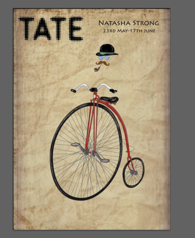
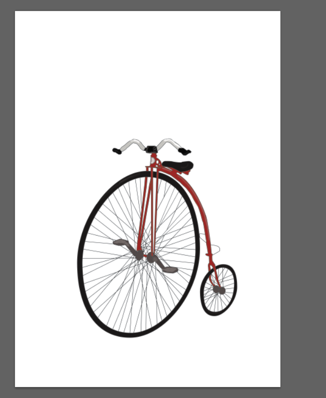
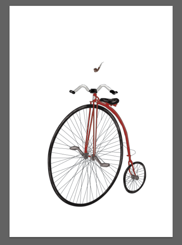
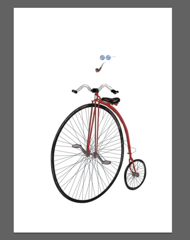
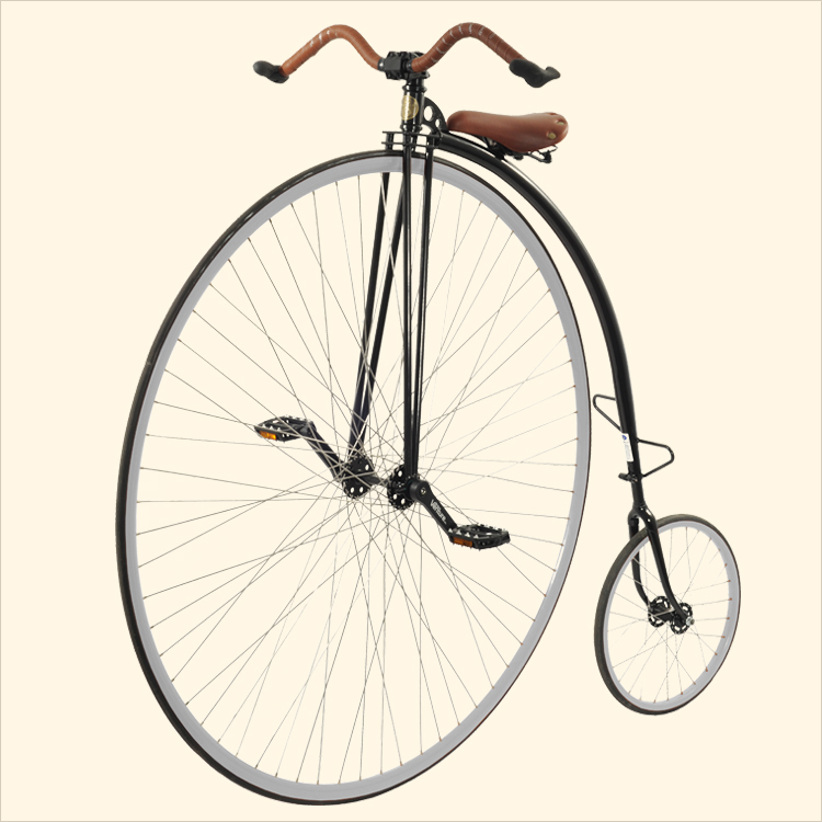
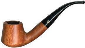
For my Final Piece I will design a poster for a hypothetical exhibition at the Tate Gallery. Having developed my pen tool images, I chose to create posters demonstrating my Penny farthing and pipe images as well as creating a poster based on one additional element, a bowler hat.
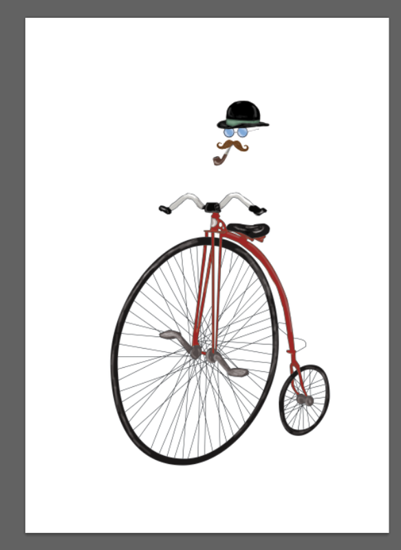
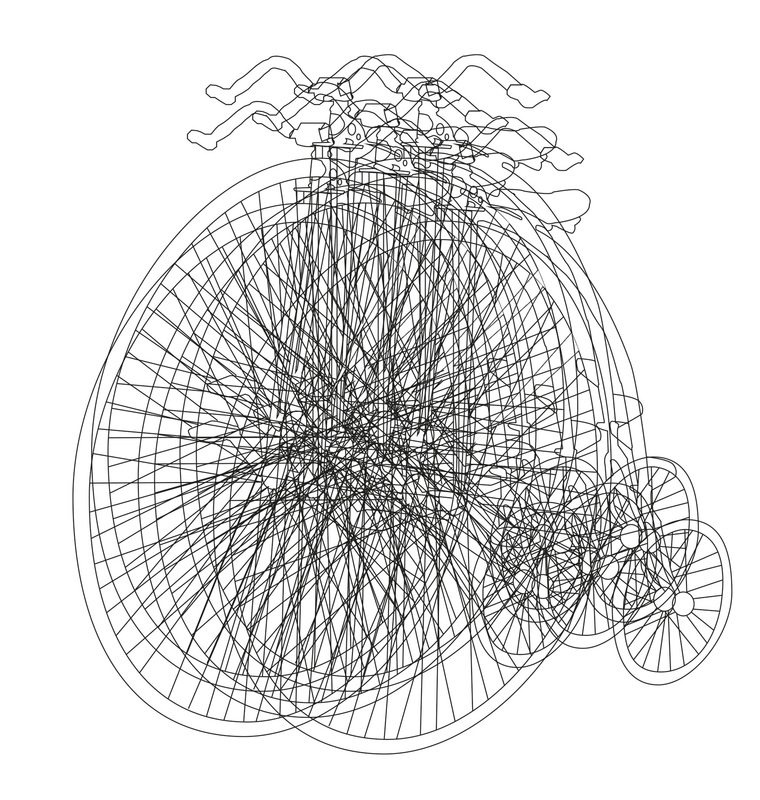
The first of my designs portrays a whimsical image of an invisible man riding the penny farthing, this design also incorporated the pipe in the subjects mouth. In this poster I added elements to the piece such as a bowler hat, glasses and a mustache to enhance the Victorian/Steam Punk feel and design.
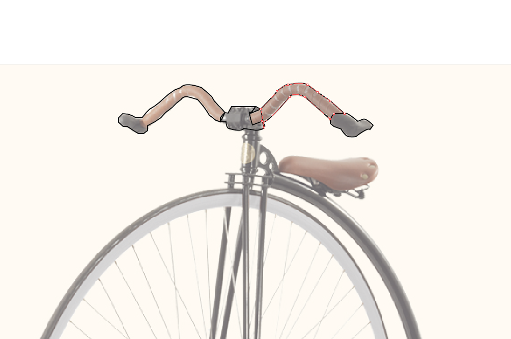
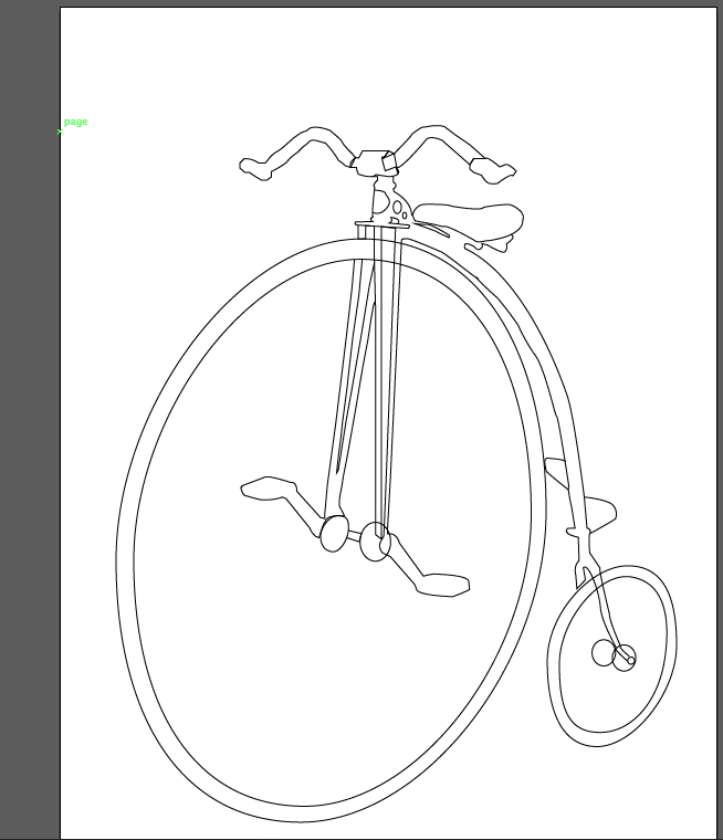
I composed the piece centrally to the page allowing the perspective of the penny farthing to reach the foreground applying the other forms in separate layers and changing the blend mode to multiply to allow the layers to sit well together.
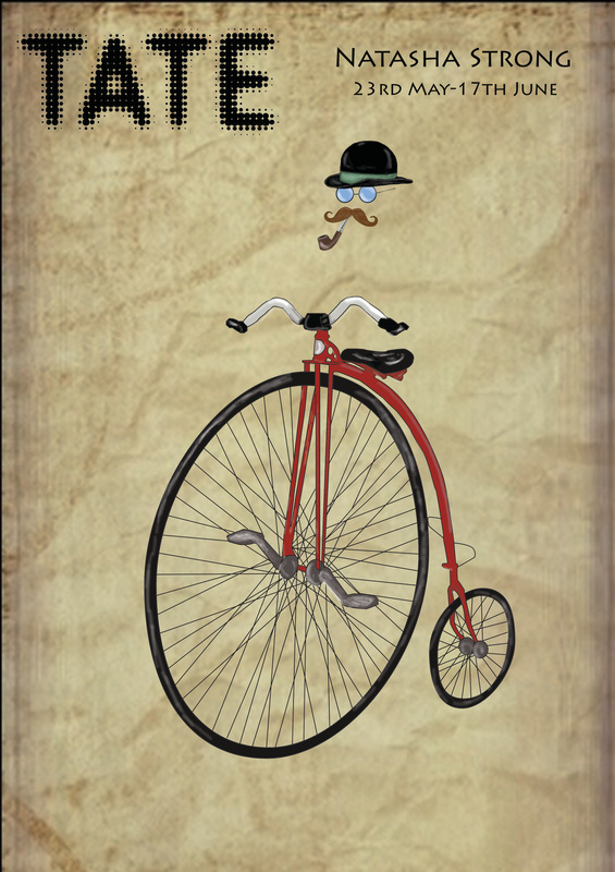
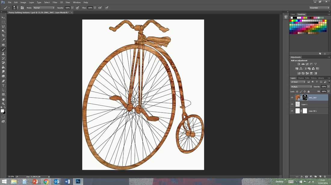
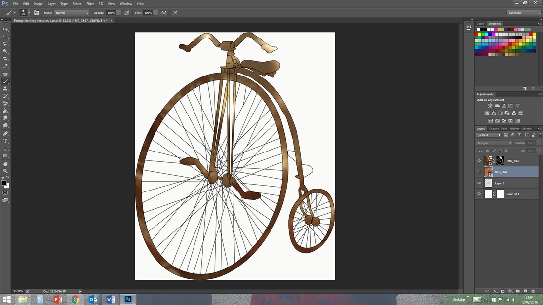
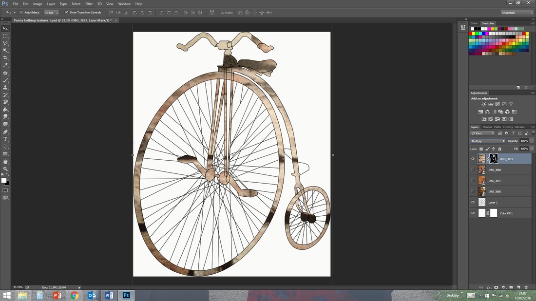
After completing this poster I felt that the stark white background did not suit the overall feel of the piece, and so referring back to my previous experiments with applying textures to work in Photoshop, I sourced a parchment texture and applied it to the background. This, I feel, ties the piece together well adding to its vintage vibe.
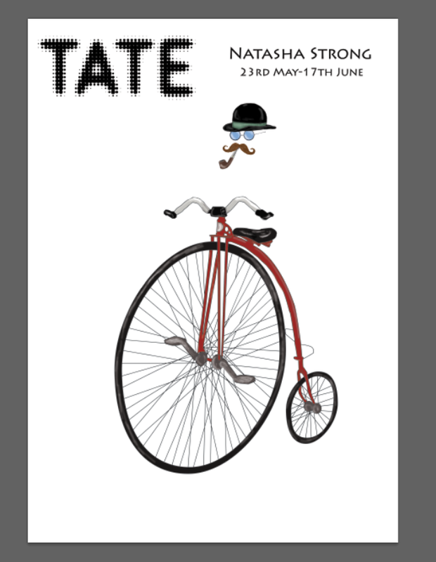
The first of my designs portrays a whimsical image of an invisible man riding the penny farthing, this design also incorporated the pipe in the subjects mouth. In this poster I added elements to the piece such as a bowler hat, glasses and a mustache to enhance the Victorian/Steam Punk feel and design.
I composed the piece centrally to the page allowing the perspective of the penny farthing to reach the foreground applying the other forms in separate layers and changing the blend mode to multiply to allow the layers to sit well together.
After completing this poster I felt that the stark white background did not suit the overall feel of the piece, and so referring back to my previous experiments with applying textures to work in Photoshop, I sourced a parchment texture and applied it to the background. This, I feel, ties the piece together well adding to its vintage vibe.
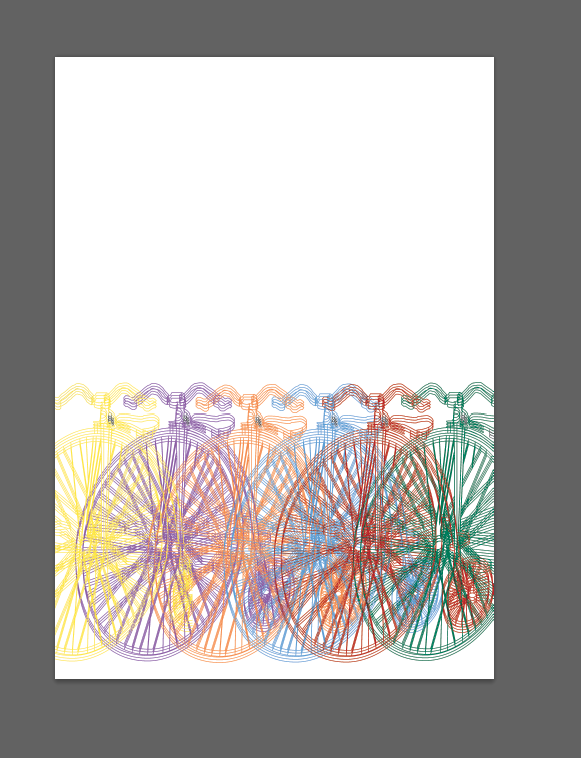
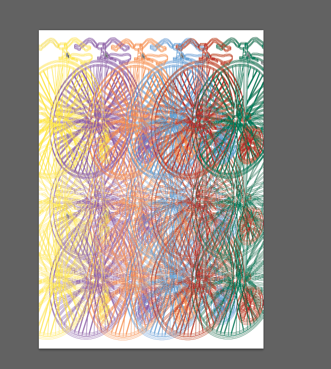
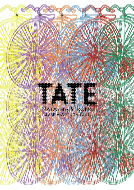
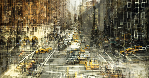
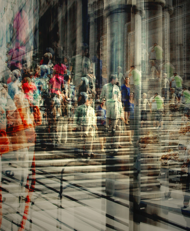
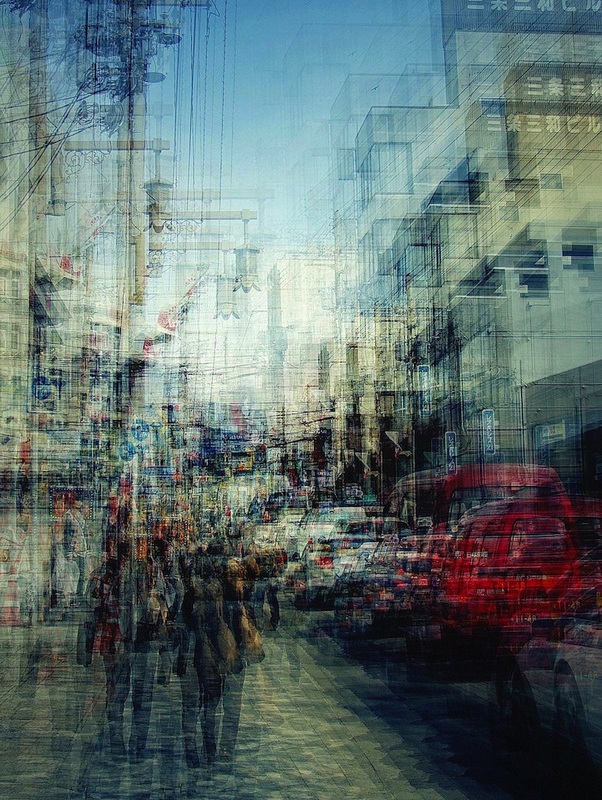
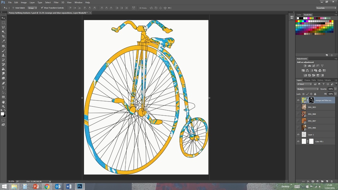
For my next poster I decide to work on a piece capturing noise and movement focusing on the Penny farthing solely. Inspired by the photographer Stephanie Jung, I coloured the outline of the penny farthing in an array of colours and repeated the image through the canvas. The effect of overlaying, repeating and overlapping created a bold and noisy image with a vivid effect on the viewer. To this I simply added the Tate logo and my exhibition dates and found this to be a very effective yet simple piece.
 |  |
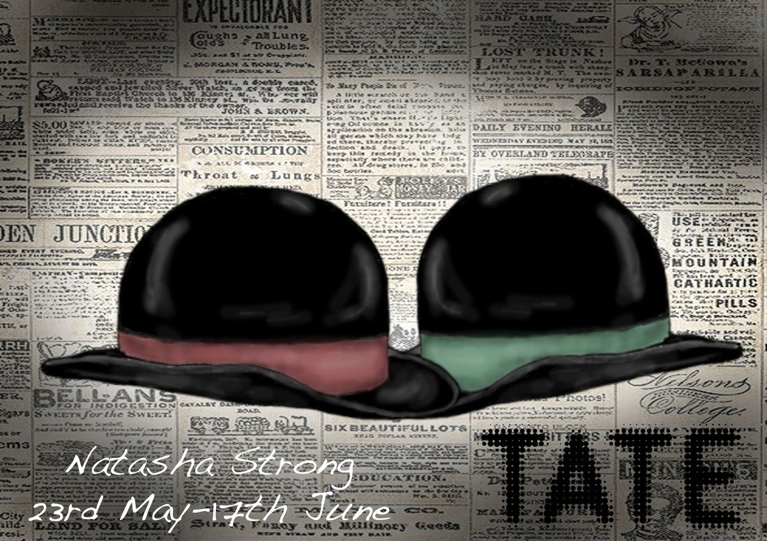
For my final poster Idea I looked back at the vintage and Victorian-esque style and wanted to work with it in a different way. Taking the Bowler hat design I had made previously, I mirrored the two and applied different band colours by adjusting the Hue. I then applied a Victorian newspaper background and added a vignette effect by applying soft low opacity brush strokes around the edge of the image.
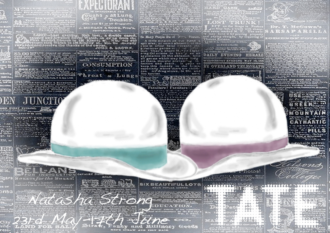
Although quite pleased with the effect achieved by this image, I decided to develop this piece further by applying different blend modes to it. One I found to be particularly appealing was an inversion of the image. This transformed the previous cheery and vintage image to a more ghostly and horror themed piece with minimal effort.
Of all these ideas I feel that my noisy repeated image is the most appealing and suitable for a Tate exhibition. The use of colour and pattern created gives it an interesting vitality and catches the eye. Throughout this unit I have developed my Photoshop skills and gained new skills within the use of Illustrator, with which I have been able to create and experiment diversely whether it be with textures, Artist research or creating my own final piece.
 RSS Feed
