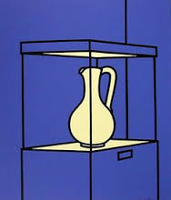
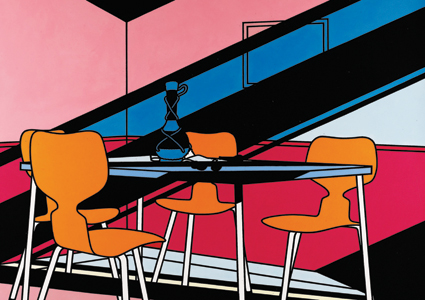
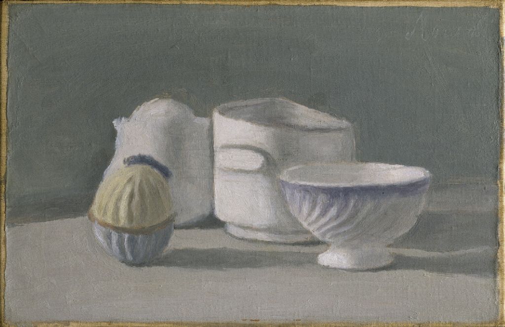
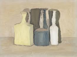
Having completed my artist research, I then went on to apply textures and colours to my pen tool images to replicate the works of Giorgio Morandi and Patrick Caulfield.
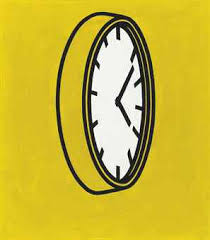
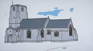
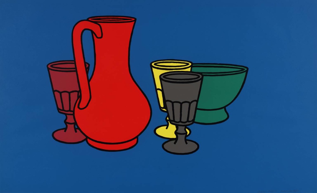
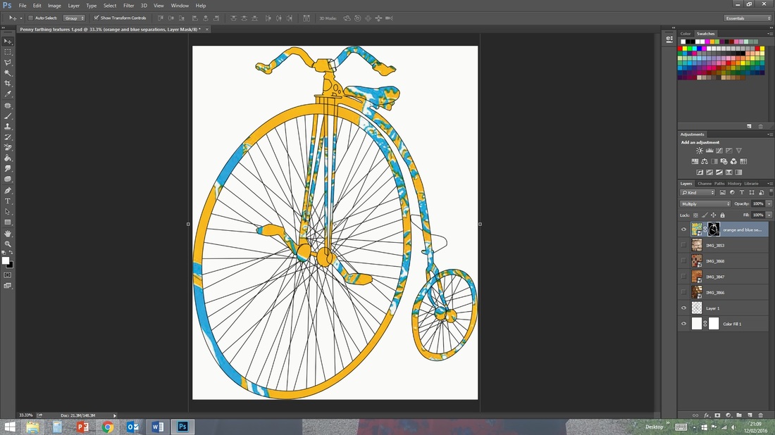
To replicate Caulfield's style I kept the strong lines on my pen tool images and solidly filled in areas of the image with the magic wand selection tool and the paint bucket. I also chose a range of strong and vibrant colours to fit with Caulfield's enigmatic work.
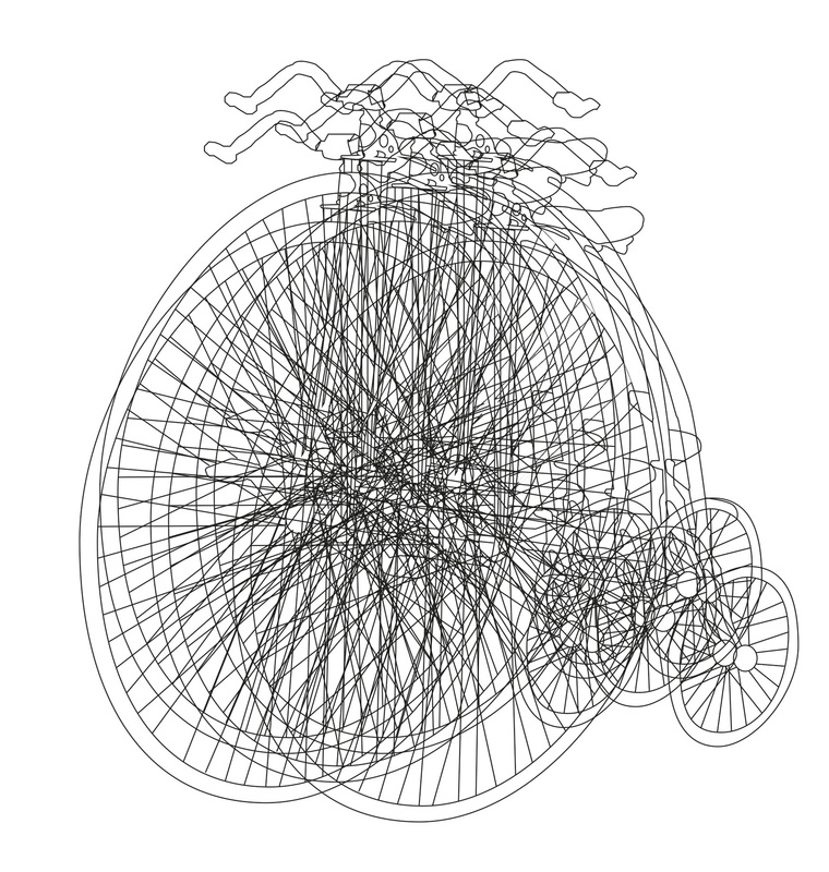
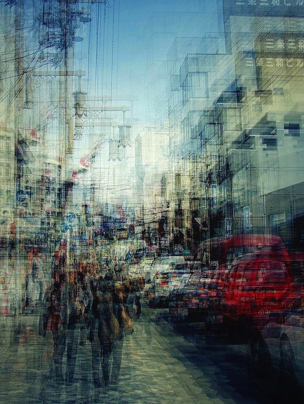
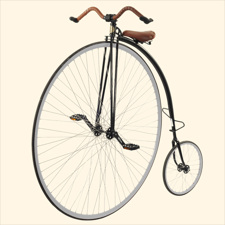
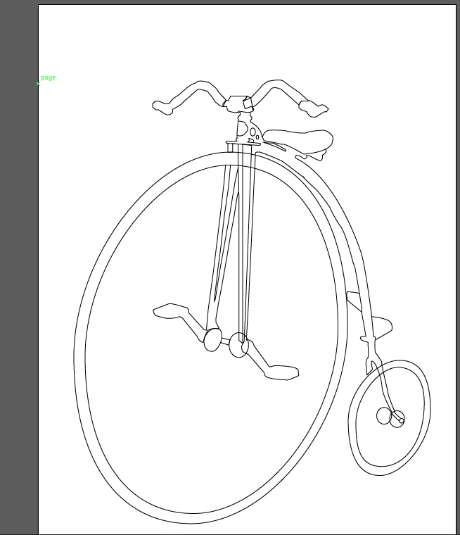
For Jung's work I simply repeated the line art of the Penny farthing to create a busy piece with less focus on the main image as a whole. For my final piece and design work I think this piece requires more colour and blur to fit best with Jung's style.
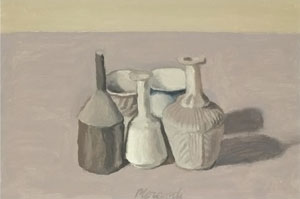
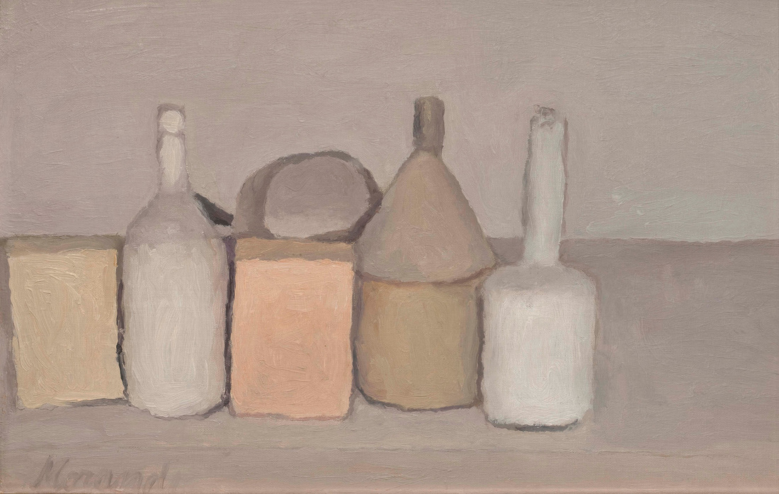
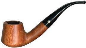
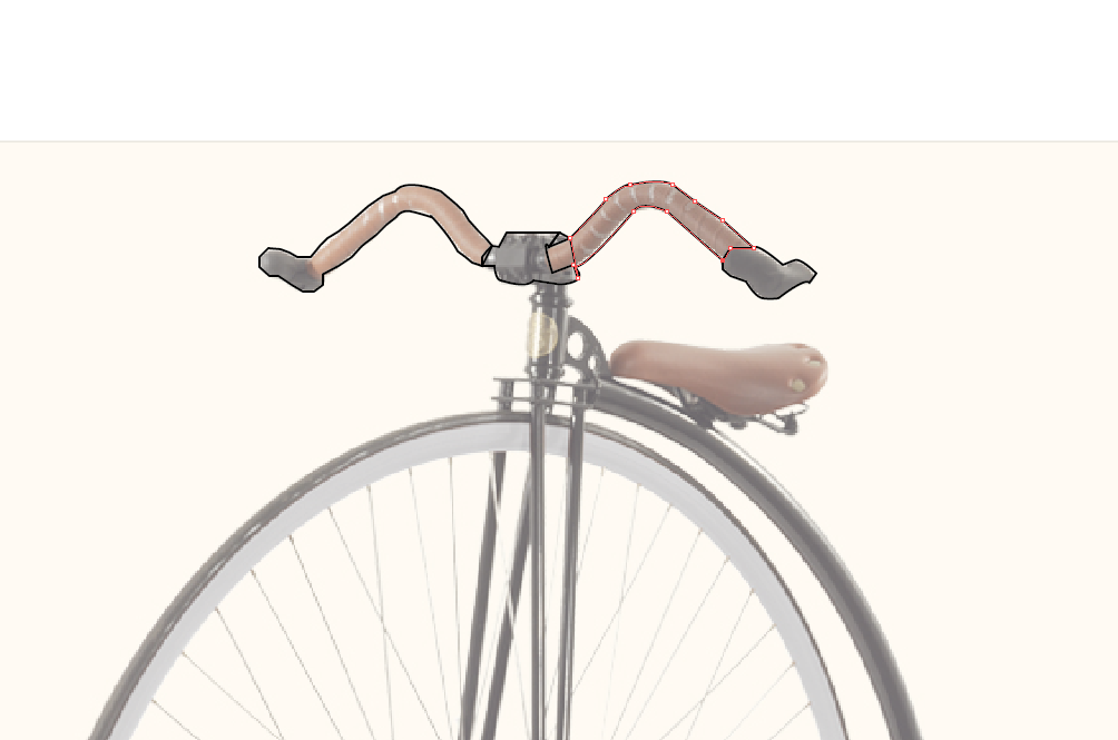
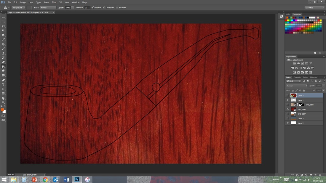
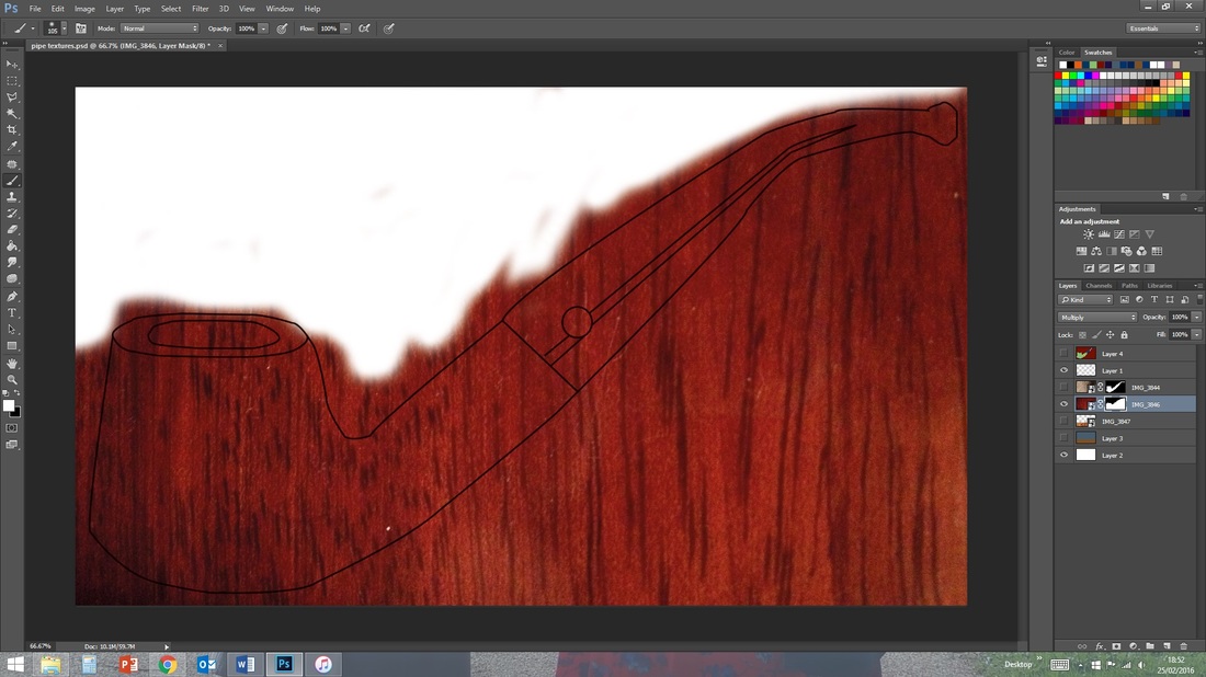
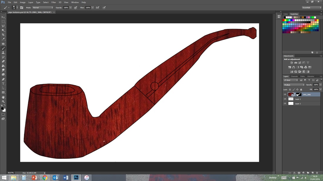
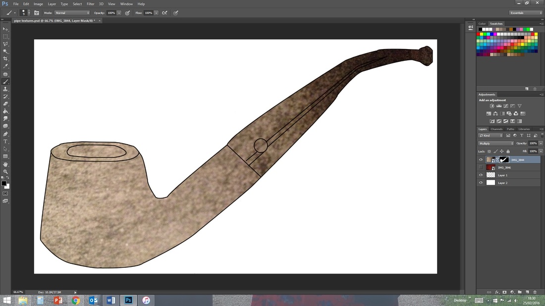
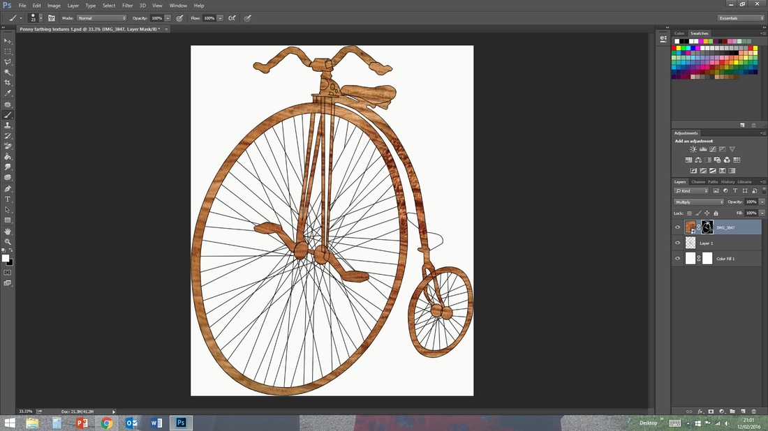
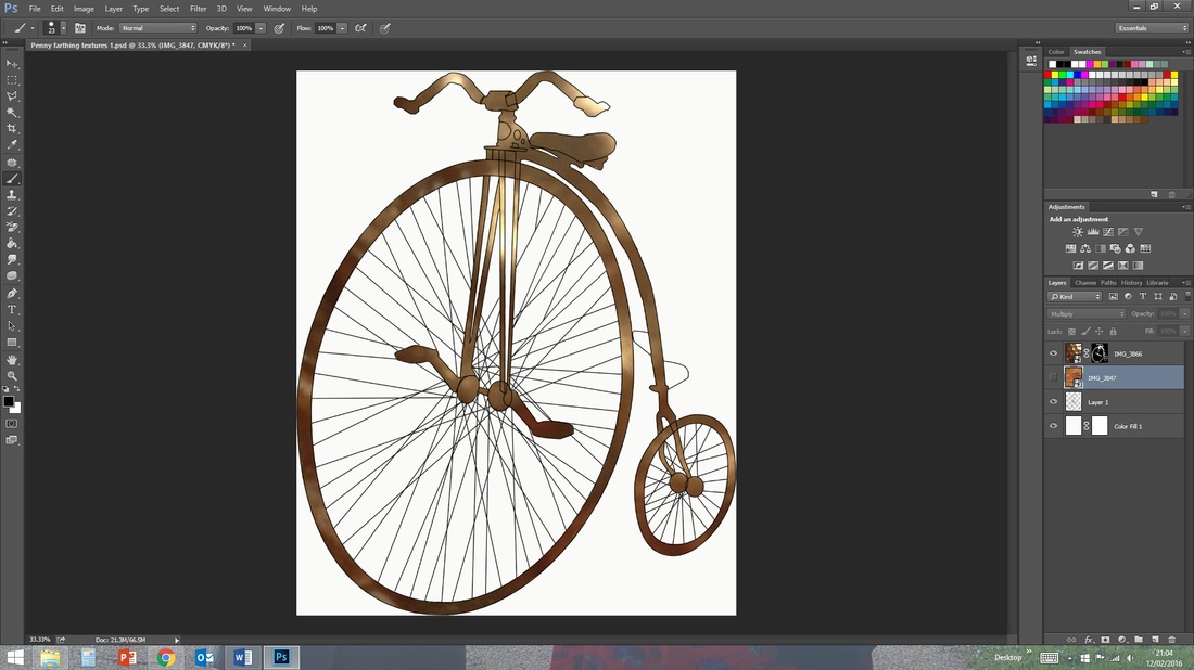
Morandi's work is more muted and there is always an element of shallow perspective with the impression of a surface created. I replicated this by colouring the background in two segments, one the true background and the other the surface that the item is resting on. In the case of the pipe image I used one of my textures to add more depth to the surface as well as applying a texture to the main image.
Of the styles I prefer the effects of Caulfield's and Jung's works as I feel they best fit the feel of the black line and digital image alongside the units theme of man made. Using one of these styles, I believe would be more attractive as an exhibition advertisement.
 RSS Feed
