*Note: All credit goes to the artists selected, I do not claim rights to any of these pieces*
Patrick Caulfield
Caulfield was an english painter and printmaker making various Pop Art works. Caulfield created original and unique pieces with striking solid colours and bold defining lines; working to create pieces flat with colour and perspective. In his later years Caulfield developed his style to incorporate elements of photorealism combined with his own simplistic style choice, through this his pieces were refined and gained more depth.
Bibliography:
http://www.tate.org.uk/art/artists/patrick-caulfield-873
http://www.tate.org.uk/art/artists/patrick-caulfield-873
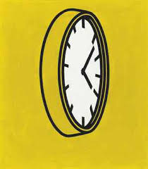 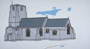 | 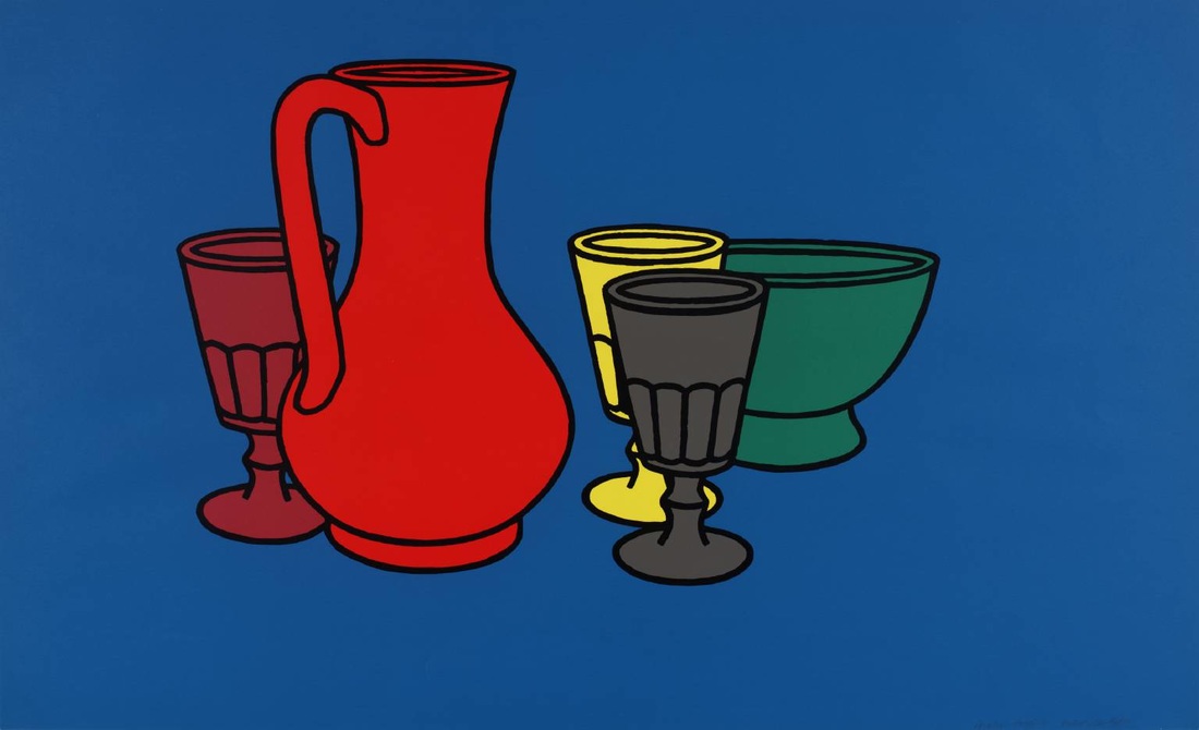 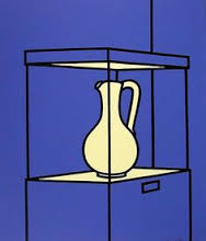 |
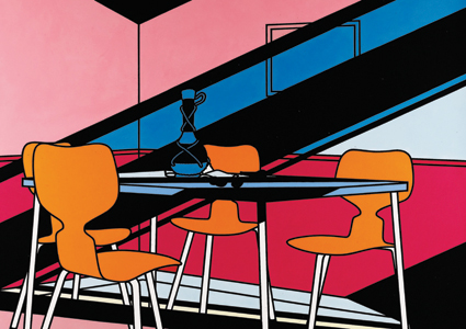
Key to Caulfield's work are the elements of line and colour. Caulfield creates pieces based on man made objects and scenes, with the focus mostly placed on the object and the background left mostly untouched bar the addition of solid colour.
In Caulfield's earlier works rich solid colours were his choice in colouring his pieces. He often used primary colours and worked with contrasting colours when capturing multiple objects in one scene.
As an artist Caulfield was known for creating his works through painting and printing. He did away with the formal approach where brush strokes are integral and rose with the Pop Art movement of flat colour with imperceptible brush marks. Caulfield Isolates each colour, keeping them separate with no colour blending whatsoever. This is similar to the work I have been doing with my pen tool illustrations. Using Photoshop I could use methods and techniques similar to Caulfield; using the paint pot to fill areas of my Penny Farthing and Pipe, using bold and contrasting colours with a solid colour for the background and keeping the boldly defined lines created by using the pen tool in Illustrator.
In my opinion Caulfield's work is incredibly effective. Through simplistic methods he created original pieces of work effectively. The subject of each piece is easily identifiable and the progression of his work to more intricate levels improves the quality and aesthetic effect shown. However, I do prefer his later works incorporating larger quantities of colour in developing a simple form of shading.
Giorgio Morandi
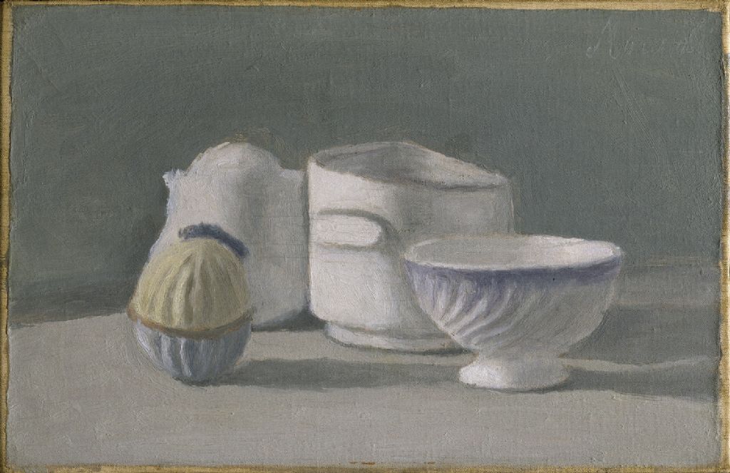
Morandi was an Italian artist specialising in etchings of landscapes and still life. His pastel and paint work was renowned for its hard, smooth forms and slight distortion of perspective allowing each subject to be viewed at one time.
Bibliography:
https://en.wikipedia.org/wiki/Giorgio_Morandi
http://www.tate.org.uk/art/artists/giorgio-morandi-1660
https://en.wikipedia.org/wiki/Giorgio_Morandi
http://www.tate.org.uk/art/artists/giorgio-morandi-1660
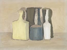 | 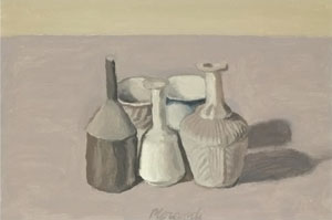 |
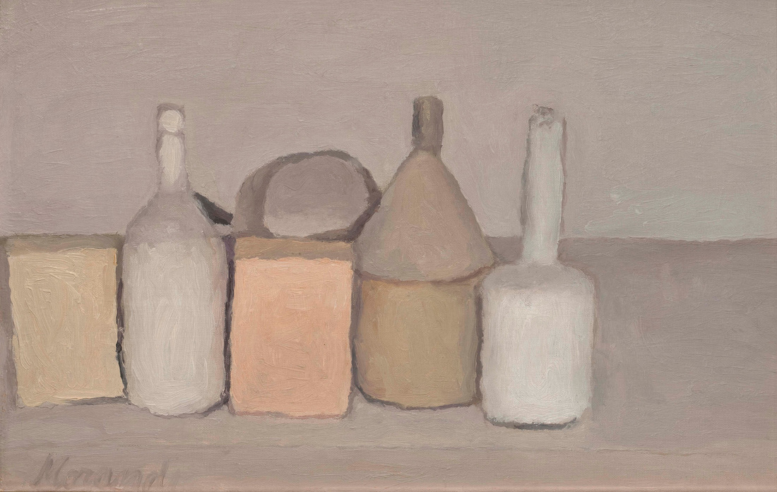
The key elements in each of Morandi's still life pieces are the subject of the bottles and containers themselves. Theses subjects are the sole focus of the piece and the background is left to flat colour with slight definition of a surface so the objects don't just appear to be floating. Morandi uses muted natural tones. The colours are fairly flat as there is only minimal shading present in similar tones as well as the indication of pattern in the subject.
Morandi used paints and pastels to create his works. The mark making in these pieces is fairly visible but softened by the uses of similar colours that softly blend into one another.
For my own work I could, inspired by Morandi, take pictures of different textures similar to his work; pictures of muted tones of clay, plaster and oil pastels. I could then apply these textures to my pen tool image and soften the lines to more muddy tones to create images with elements inspired by Morandi.
Morandi's work is simplistic and effective. The distorted perspectives he provides allows the viewer to see each of the subjects in his still life work and his choice of soft and muted colours that gently transition into one another tying together the whole piece from individual items.
Stephanie Jung
Jung is a Berlin based Photographer, specialising in experimental photography of landscapes and city scenes. A keen traveler her artworks consist of multiple exposure scenes of diverse cities, landscapes and cultures.
Bibliography:
http://www.cooph.com/magazine/features/techniques/detail/article/profolio-the-textured-moments-of-stephanie-jung.html
http://portfolio122826.format.com/
Bibliography:
http://www.cooph.com/magazine/features/techniques/detail/article/profolio-the-textured-moments-of-stephanie-jung.html
http://portfolio122826.format.com/
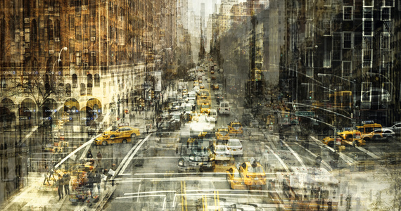
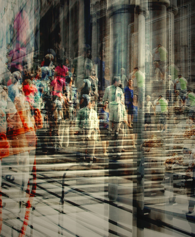
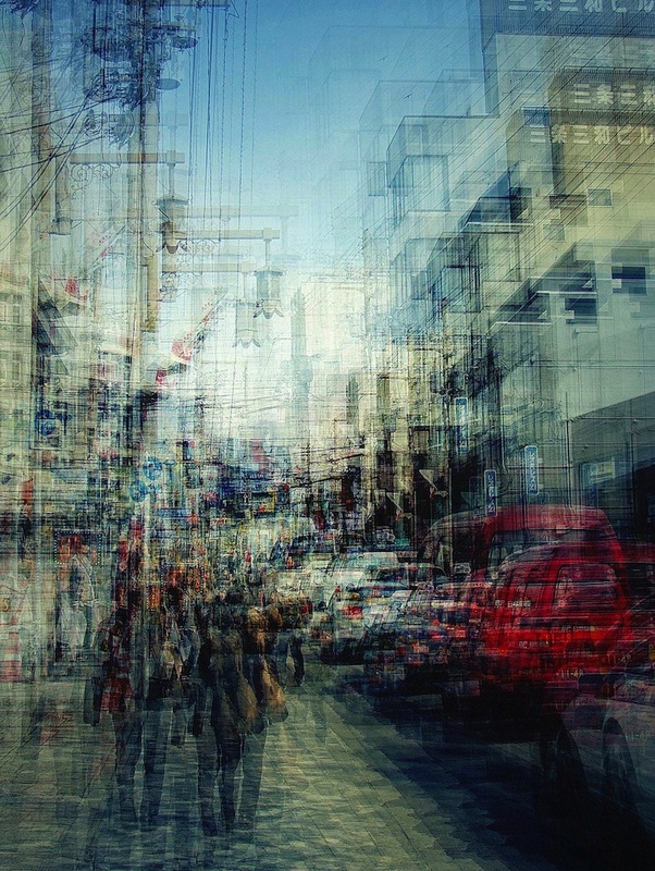
Jung's photographs mainly focus on already busy scenes. The busy streets filled with traffic and people are enhanced by her multiple exposure techniques. The faces begin to blur and the idea of noise and movement is very cleverly captured within these works. These images are also bold and vibrant accentuating the vitality and business of the subject captured. All of the colours are enhanced to draw them out and allow some focus to be formed through the noise.
I can use a style similar to Jung's in my own work by repeating and overlaying my pen tool images to create a unique and busy design, this I could enhance by applying similar sized shapes or by using the same shape in various sizes and colours on the image.
Jung's work is incredibly eye catching and the style of which would work well as a poster drawing the views focus.
*Note: All credit goes to the artists selected, I do not claim rights to any of these pieces*
 RSS Feed
